
Certification: MTA: Introduction to Programming Using HTML and CSS
Certification Full Name: Microsoft Technology Associate Introduction to Programming Using HTML and CSS
Certification Provider: Microsoft
Exam Code: 98-383
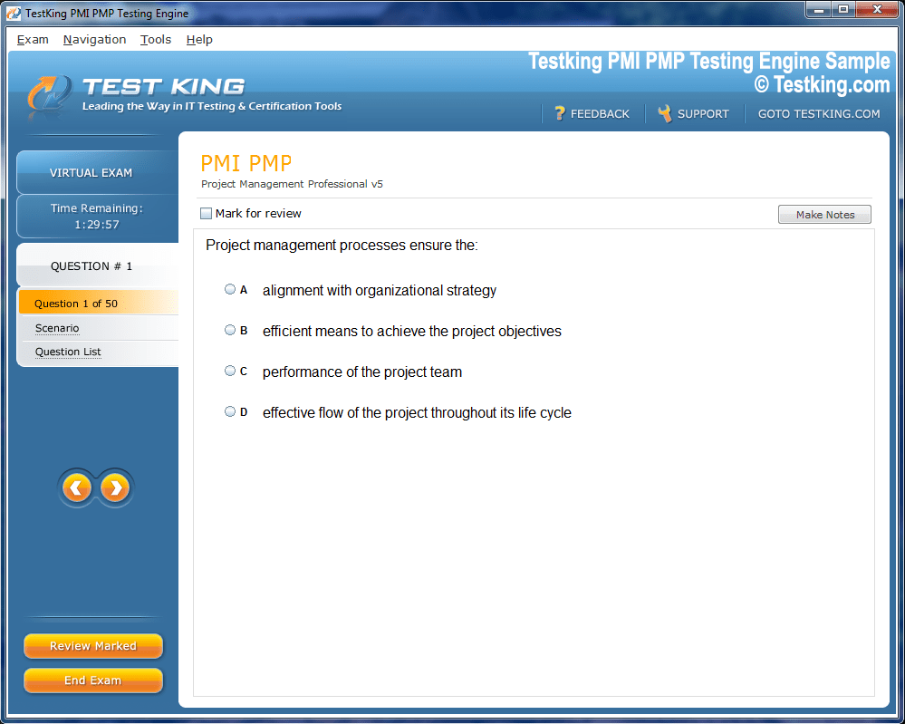
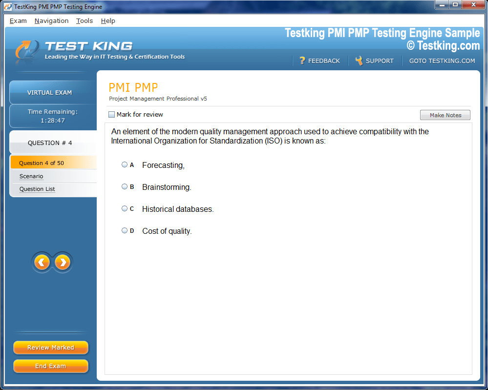
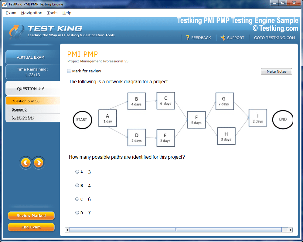
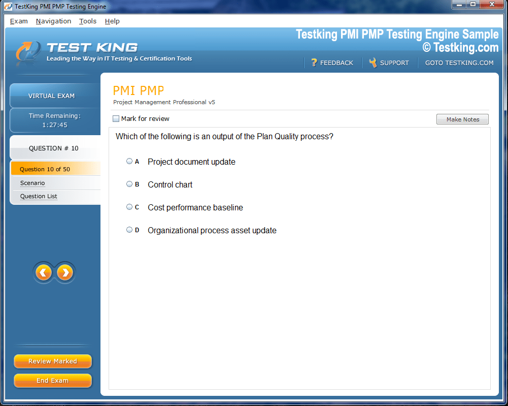
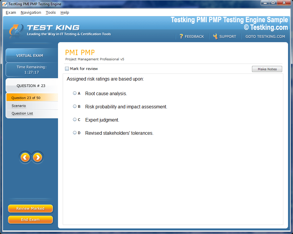
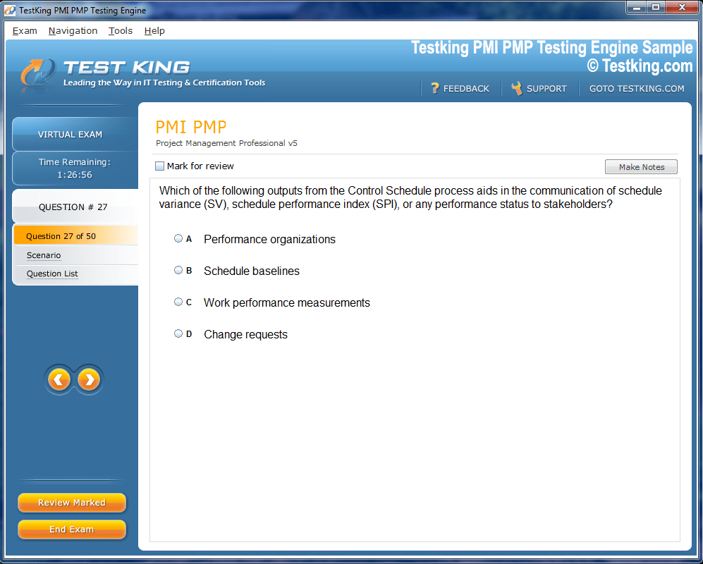
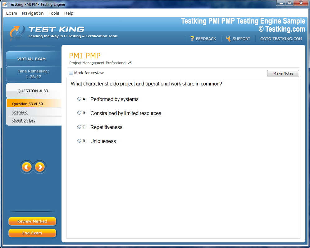
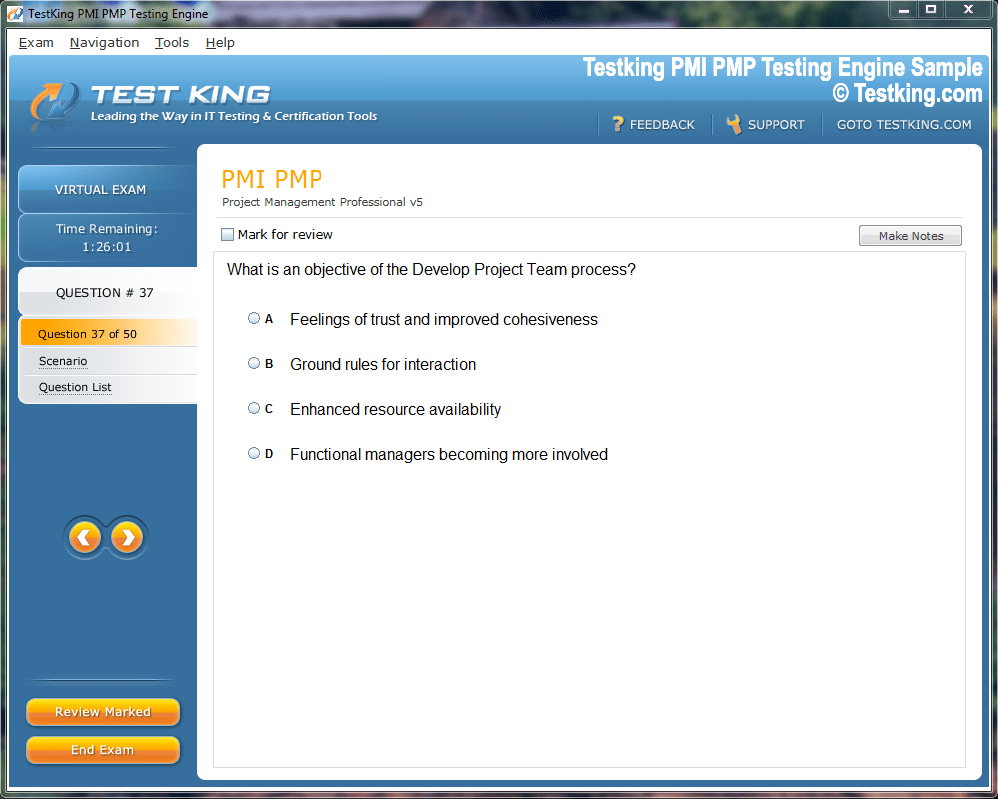
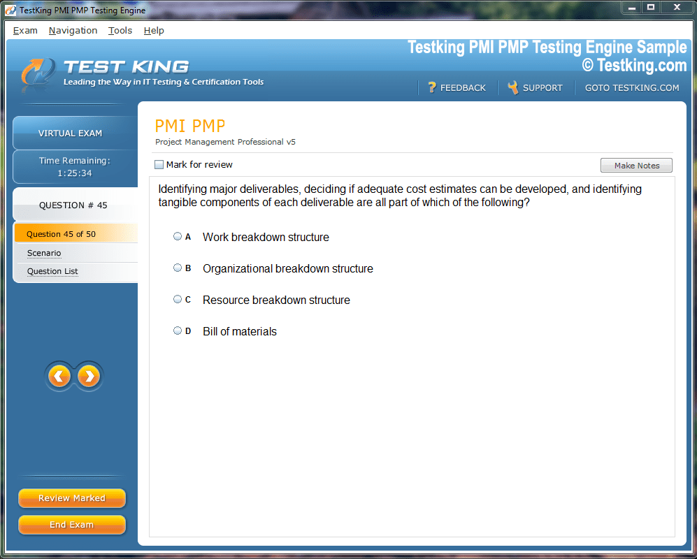
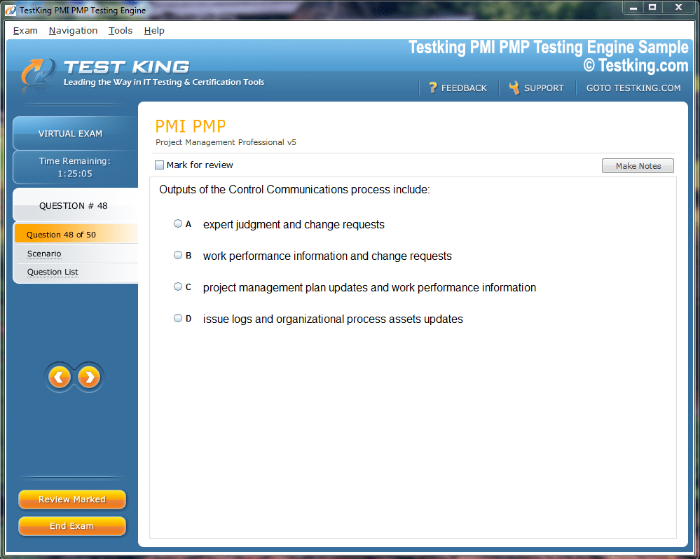
Product Screenshots
nop-1e =1
Professional Learning Path for MTA Introduction to Programming Using HTML and CSS Certification
The MTA Introduction to Programming Using HTML and CSS course provides an essential foundation for individuals aspiring to enter the technological domain. This course offers a comprehensive exploration of core programming principles through practical application of HTML and CSS. It establishes a framework that aids in understanding how to structure web content, apply styles, and integrate multimedia elements into digital interfaces. Participants develop the capacity to craft syntactically accurate code, interpret style hierarchies, and employ semantic HTML to create coherent and accessible web pages. The certification, although not qualifying for MCP accreditation or a prerequisite for MCSA or MCSD, serves as a robust measure of foundational programming aptitude.
The target audience for this certification encompasses developers seeking to formalize their knowledge of web-based technologies. The associated examination, 98-383, evaluates a candidate’s proficiency in HTML and CSS, focusing on creating and manipulating web content while adhering to industry standards. Candidates are expected to possess approximately 100 hours of experience through instruction or hands-on practice, enabling them to demonstrate competency in composing, debugging, and maintaining HTML and CSS code in a structured and standardized manner.
The MTA Introduction to Programming Using HTML and CSS course encompasses multiple competencies crucial for web development. These competencies include understanding fundamental HTML concepts, implementing CSS to define visual aesthetics, structuring documents to organize content, integrating multimedia resources, and applying consistent design patterns to ensure usability and accessibility. By mastering these skills, candidates can construct functional, visually appealing, and semantically sound web pages, fostering a foundation upon which more complex programming knowledge can be developed.
Understanding HTML Fundamentals
HTML serves as the backbone of web development, providing the structural framework for content presentation. The course emphasizes the creation of well-formed markup, incorporating metadata elements, proper syntax, and semantic constructs. Candidates learn to construct tags such as script, link, meta, and style, ensuring appropriate encoding, keyword definition, and viewport configuration. The declaration of document type, along with proper usage of HTML, head, and body elements, is foundational to developing compliant web pages.
The curriculum underscores the importance of adhering to best practices, which include the proper closure of tags, incorporation of comments, and utilization of special characters. These practices ensure that markup remains readable, maintainable, and compatible across diverse browsers. Additionally, candidates are encouraged to develop an understanding of HTML entities, which enable the correct rendering of reserved characters and symbols, adding an extra layer of precision to web content.
A significant aspect of HTML mastery involves understanding the hierarchy and nesting of elements. Properly nested tags enhance document clarity and accessibility. Candidates are instructed to employ heading tags from h1 to h6 judiciously, ensuring content is semantically organized. Paragraphs, line breaks, horizontal rules, div containers, and span elements are used to compartmentalize content logically, establishing a cohesive flow for both visual rendering and assistive technologies.
Exploring CSS Fundamentals
Cascading Style Sheets provide the mechanism to control the presentation of HTML elements. The course introduces candidates to inline styles, internal style sheets, and external style sheets, emphasizing when and how to use each effectively. Understanding the specificity and priority of styles, particularly when multiple style sources are combined, is critical for producing consistent visual output.
Rule sets, including selectors and properties, form the foundation of CSS. Candidates learn to apply class, ID, element, and pseudo-class selectors to achieve precise targeting of content. Each rule is constructed with proper syntax, encompassing property-value pairs, semicolons, and appropriate nesting where necessary. Emphasis is placed on the reuse of rules, commenting for clarity, and cross-browser testing to ensure uniform appearance across multiple platforms.
The course encourages the creation of well-structured style sheets that conform to best practices. This includes proper commenting, organization of rules, and selection of web-safe fonts. Candidates gain insight into the box model, encompassing margins, padding, borders, and content areas. This understanding is essential for positioning elements accurately and achieving visually balanced layouts.
Structuring Content with HTML
A key component of web development is the organization of content. The course guides candidates in the construction and analysis of markup that structures data logically. This involves the application of tables, lists, headings, paragraphs, line breaks, horizontal rules, and container elements. Divisions and spans are used to segment content for styling and layout purposes.
HTML5 semantic elements play a pivotal role in establishing meaningful content organization. Elements such as header, nav, section, article, aside, footer, main, figure, and figcaption provide contextual significance to the content. The course emphasizes the importance of semantic markup in enhancing accessibility, improving search engine interpretation, and maintaining consistency in presentation.
Navigation is another critical focus area. Candidates learn to implement hyperlinks, distinguishing between absolute and relative paths, and leveraging target attributes to control link behavior. This facilitates seamless movement across web pages and directories, enhancing user experience and interconnectivity. The curriculum also explores form construction, encompassing input types, selection elements, text areas, checkboxes, radio buttons, data lists, and fieldsets. Proper utilization of attributes like type, action, and method ensures forms are functional and accessible.
Incorporating Multimedia Using HTML
Web pages are increasingly enriched with multimedia components, and the course provides detailed instruction on their integration. Image display is handled through the img and picture elements, with attention to attributes such as source, alt text, width, height, and responsive adjustments. Candidates are also exposed to the use of svg and canvas elements for vector graphics and dynamic rendering, expanding creative possibilities.
Audio and video integration is accomplished through audio and video elements, with support for tracks, sources, and simple iframe embedding. The curriculum addresses accessibility considerations, ensuring multimedia content is usable by a diverse audience. Candidates learn to manage media playback controls, fallback content, and compatibility considerations, preparing them for real-world implementation scenarios.
The inclusion of multimedia is not only about functionality but also about enhancing the user experience. Candidates are encouraged to consider layout, placement, and responsiveness when embedding media, ensuring that content remains visually harmonious and performance-efficient. This attention to detail reinforces the principles of web design while promoting technical precision.
Styling Web Pages with CSS
The application of CSS to style web pages involves defining layouts, typography, backgrounds, and borders. Candidates are instructed in content positioning, utilizing float, relative and absolute positioning, max-width, overflow, height, width, alignment, and display properties. Understanding the box model remains central, as it governs element dimensions and spacing, ensuring consistency across layouts.
Text styling encompasses font family selection, color, font style, size, weight, link colors, text alignment, and decoration. Candidates are taught to balance readability and aesthetics, crafting styles that are visually appealing while maintaining semantic clarity. This includes consideration of line height, letter spacing, and text transformation, which contribute to the overall visual hierarchy of the page.
Backgrounds and borders are styled using properties such as border-color, border-style, border-width, and background attributes. The curriculum emphasizes creativity within structured design, enabling candidates to produce pages that are engaging yet maintain usability standards. By combining positioning, typography, and background styling, candidates gain proficiency in creating cohesive and professional web interfaces.
Practical Applications and Skill Integration
The course encourages the integration of learned concepts through practical exercises. Candidates are tasked with building sample web pages that incorporate structured content, multimedia, and styled elements. These exercises reinforce comprehension, enhance problem-solving abilities, and cultivate attention to detail. By engaging with real-world scenarios, candidates develop the capacity to address common web development challenges effectively.
Throughout the course, emphasis is placed on testing and debugging. Candidates learn to identify syntax errors, resolve styling conflicts, and ensure compliance with best practices. Browser testing, accessibility evaluation, and performance optimization are integral components, preparing candidates for the multifaceted demands of modern web development.
Ultimately, the MTA Introduction to Programming Using HTML and CSS course establishes a robust foundation for aspiring developers. It equips participants with essential skills, technical knowledge, and practical experience, forming a springboard for advanced learning and specialization. By mastering these fundamental concepts, candidates gain confidence and competence in creating functional, accessible, and aesthetically compelling web pages.
Advanced HTML Structuring and Semantic Practices
A deeper understanding of HTML necessitates proficiency in semantic structuring and the utilization of advanced elements to convey meaning and enhance accessibility. Semantic HTML tags facilitate a logical flow of content, improving both human readability and machine interpretability. Tags such as <header>, <footer>, <main>, <article>, <section>, <aside>, <nav>, <figure>, and <figcaption> create a coherent structure that enables assistive technologies to navigate web content efficiently. The course emphasizes the importance of contextual accuracy when choosing semantic elements, ensuring that each tag accurately represents the content it encloses.
Candidates are trained to incorporate hierarchical organization within documents. Headings must be used sequentially, creating a structured outline that allows both users and search engines to understand the relative importance of information. Paragraphs, lists, and div containers are employed strategically to group related content. This approach not only enhances readability but also simplifies future maintenance and modification of web pages.
The practice of nesting elements correctly is emphasized to prevent rendering errors and maintain syntactic integrity. Proper nesting ensures that child elements are enclosed within appropriate parent tags, preserving both visual alignment and functional behavior. Comments and metadata are also included to provide additional context, improving clarity for developers and ensuring that essential information about document structure and character encoding is accessible.
Forms and User Input Handling
Forms constitute a crucial aspect of interactive web pages, enabling user input and data submission. The course covers a comprehensive array of form elements, including input types, checkboxes, radio buttons, text areas, select dropdowns, data lists, and fieldsets. Candidates learn to implement attributes such as type, action, method, name, and placeholder to control the behavior and submission of form data effectively.
Attention is given to accessibility considerations, including labeling elements, grouping related fields, and providing clear instructions for users. This ensures that forms are usable by individuals with disabilities and compatible with assistive technologies. The course also addresses validation techniques, emphasizing the importance of preventing erroneous or malicious input through client-side and server-side measures.
The integration of forms extends to navigation and user interaction. Forms are used in registration pages, search functions, surveys, and feedback mechanisms, making them a central component of dynamic websites. Candidates gain the ability to structure forms logically, apply consistent styling, and manage data submission in a secure and user-friendly manner.
Multimedia Integration and Optimization
Enhancing web pages with multimedia elements requires both technical knowledge and aesthetic sensibility. The course explores the use of images, audio, and video to create engaging, interactive experiences. Candidates learn to implement image elements with appropriate attributes such as src, alt, width, and height, ensuring images are both responsive and accessible. The inclusion of vector graphics using <svg> and interactive graphics with <canvas> expands creative possibilities while maintaining compatibility across browsers.
Audio and video elements are integrated using <audio> and <video> tags, along with associated attributes such as controls, autoplay, loop, and source management. Candidates learn to provide fallback content and alternative media formats to ensure accessibility and functionality across different devices. Attention is given to the balance between visual appeal and performance, optimizing media files to reduce load times while maintaining quality.
Embedding multimedia is complemented by considerations for layout and responsiveness. Candidates explore how multimedia interacts with surrounding content, ensuring that placement, alignment, and scaling are consistent with overall design principles. This approach fosters a seamless user experience while reinforcing the importance of precision in coding and design.
CSS Positioning and Layout Techniques
CSS positioning and layout are critical to crafting visually structured and navigable web pages. The course introduces positioning techniques including static, relative, absolute, and fixed positions, alongside float management and z-index control. Candidates learn to manipulate element dimensions using width, height, max-width, min-width, and overflow properties, ensuring content remains within desired boundaries without disruption to surrounding elements.
The box model is reinforced as a conceptual framework for understanding element spacing, including margins, padding, borders, and content area. Candidates gain proficiency in calculating dimensions accurately, allowing precise placement of elements and consistent alignment across different devices and screen sizes. Flexibility in layout design is emphasized, enabling the creation of both fixed and fluid layouts that adapt seamlessly to user environments.
Candidates are also trained in advanced layout techniques, including the use of grids, flexbox, and positioning strategies that support responsive design. This knowledge allows them to structure complex web pages with multiple components while maintaining clarity, accessibility, and visual harmony.
Typography and Text Styling
Text remains a fundamental component of web content, and CSS provides extensive control over its presentation. Candidates are introduced to font family selection, font-size adjustment, font-style options, weight variation, color application, and text alignment. Emphasis is placed on legibility, contrast, and consistency, ensuring that textual content is both readable and aesthetically pleasing.
Advanced text styling techniques, such as line-height manipulation, letter spacing, word spacing, text decoration, text transformation, and text-shadow effects, enable candidates to enhance visual hierarchy and emphasize key content areas. Hyperlinks are styled for visual consistency and user recognition, with attention to hover effects and active states to improve navigation clarity.
Candidates are trained to harmonize typography with overall page design, balancing readability, visual appeal, and functional requirements. This holistic approach ensures that textual content integrates seamlessly with images, multimedia, and layout structures, enhancing user engagement and comprehension.
Styling Backgrounds and Borders
Backgrounds and borders are pivotal for defining visual boundaries and enhancing aesthetic appeal. Candidates learn to manipulate border properties including width, style, color, and radius, creating distinct separation between elements while maintaining cohesion with surrounding design elements. Background properties, such as color, image, size, position, repeat behavior, and attachment, provide opportunities for creative and functional design.
The course emphasizes the interplay between backgrounds, borders, and content, demonstrating how subtle adjustments can significantly impact visual hierarchy and user perception. Candidates are encouraged to experiment with gradients, patterns, and layered backgrounds, applying best practices to maintain accessibility and performance.
Cross-Browser Compatibility and Best Practices
Ensuring consistent presentation across multiple browsers is an essential skill for web developers. Candidates are taught techniques to test and debug HTML and CSS in various environments, addressing discrepancies in rendering, alignment, and media handling. Best practices include using reset or normalize stylesheets, validating markup, and employing feature detection to adapt styles based on browser capabilities.
Commenting and documentation are emphasized as integral components of maintainable code. Well-documented stylesheets facilitate collaboration, future modifications, and troubleshooting. Candidates develop the habit of organizing rules logically, grouping related styles, and employing reusable classes to reduce redundancy and enhance efficiency.
Hands-On Projects and Practical Exercises
The course integrates practical exercises designed to consolidate theoretical knowledge. Candidates engage in projects that require constructing web pages with structured content, multimedia elements, styled typography, and responsive layouts. These exercises encourage problem-solving, critical thinking, and attention to detail, enabling candidates to apply learned concepts in realistic scenarios.
Feedback mechanisms, including peer review and instructor evaluation, provide opportunities to refine coding techniques and design decisions. Candidates learn to approach challenges methodically, testing functionality, resolving conflicts, and optimizing performance. This experiential learning reinforces foundational skills while preparing candidates for real-world web development tasks.
Preparing for Certification Assessment
Preparation for the 98-383 examination involves both conceptual understanding and practical proficiency. Candidates are advised to review HTML and CSS fundamentals, practice coding exercises, and evaluate the functionality and presentation of web pages across multiple browsers. Emphasis is placed on accurate syntax, semantic structuring, effective styling, and accessibility compliance.
Simulation of exam scenarios, including timed practice tests and project-based evaluations, helps candidates build confidence and improve time management. Mastery of the exam objectives ensures that candidates can demonstrate comprehensive knowledge of web development principles, laying the groundwork for further study and professional application.
Integration of Skills and Knowledge
The MTA Introduction to Programming Using HTML and CSS course fosters the integration of multiple competencies. Candidates synthesize HTML structuring, multimedia inclusion, and CSS styling into cohesive web pages that are both functional and visually engaging. This integrated approach emphasizes the interdependence of content, presentation, and accessibility, highlighting the multifaceted nature of modern web development.
By consolidating theoretical understanding with practical application, candidates develop a holistic perspective on web programming. They gain the ability to construct, style, and optimize web pages in a manner that aligns with industry standards, user expectations, and technological best practices.
Advanced Semantic HTML and Accessibility Principles
Building upon foundational HTML knowledge, the course delves into advanced semantic practices and accessibility standards. Semantic HTML enhances comprehension for both users and machines, allowing assistive technologies to interpret web content efficiently. Tags such as <article>, <section>, <nav>, <aside>, <main>, <header>, <footer>, <figure>, and <figcaption> provide contextual meaning, supporting navigation, indexing, and content prioritization.
Accessibility considerations are paramount, and candidates are trained to implement ARIA (Accessible Rich Internet Applications) roles, labels, and attributes. These enhancements ensure that users relying on screen readers or other assistive devices can interact effectively with web pages. Focus management, tab order, and descriptive alternative text for images are emphasized to create inclusive web experiences.
Proper use of headings, lists, and landmarks reinforces content structure. Candidates learn to organize complex documents hierarchically, ensuring that each section conveys clear intent and logical progression. This practice not only aids navigation but also contributes to SEO optimization and long-term maintainability of web projects.
Form Design and Interactive Elements
Forms represent critical interactive components, enabling data collection and user engagement. Candidates explore a wide range of input types, including text fields, radio buttons, checkboxes, password inputs, number fields, range sliders, and file uploads. The course emphasizes the appropriate use of attributes such as name, type, value, placeholder, and required, ensuring robust and functional forms.
Select menus, option groups, and data lists are incorporated to facilitate user choices, while text areas provide larger input areas for descriptive responses. Fieldsets and legends offer contextual grouping, enhancing usability and accessibility. Candidates are guided to implement form validation techniques to prevent errors and maintain data integrity.
Form interactions extend to submission and navigation behavior, with methods including GET and POST. Candidates gain proficiency in structuring forms to handle real-world scenarios such as search functionalities, user registration, surveys, and content feedback. Accessibility best practices are emphasized, including descriptive labels, ARIA attributes, and keyboard navigability.
Integrating Multimedia Content Effectively
Multimedia integration extends beyond basic inclusion, focusing on both functionality and aesthetics. Images are implemented with attention to attributes like srcset, sizes, and alt, ensuring responsiveness and accessibility. Candidates learn to apply image optimization techniques to minimize file sizes without sacrificing quality, enhancing page load performance.
Vector graphics using <svg> and dynamic canvas elements provide opportunities for scalable and interactive content. Candidates are encouraged to experiment with animations, shapes, and custom illustrations, enriching the visual experience while adhering to best practices in accessibility and compatibility.
Audio and video embedding requires precise handling of elements such as <audio>, <video>, <source>, and <track>. Candidates learn to provide multiple formats to maximize compatibility across browsers and devices, ensuring playback functionality. Media controls, captions, and transcripts are implemented to comply with accessibility standards and improve user engagement.
CSS Layout and Advanced Positioning
CSS layout skills are critical for creating visually coherent and navigable web pages. Candidates learn to apply various positioning techniques, including static, relative, absolute, and fixed positions. Float management and z-index control are explored to manage stacking context and element overlap, while the box model is reinforced to calculate spacing, padding, margins, and borders accurately.
Advanced layout techniques, including flexbox and grid systems, allow for complex designs with flexible, responsive arrangements. Candidates learn to align items, distribute space, and create adaptable interfaces that respond dynamically to different screen sizes and orientations. Emphasis is placed on the practical application of these concepts to real-world web projects, ensuring visual harmony and user-friendly navigation.
Responsive design is integrated with layout strategies, encouraging candidates to use media queries, relative units, and flexible containers. This approach ensures that web pages maintain functionality and aesthetics across a range of devices, from desktops to mobile platforms, supporting modern expectations for accessible and adaptive web interfaces.
Typography and Visual Hierarchy
Typography is a fundamental element of web design, influencing readability, user engagement, and content hierarchy. Candidates are trained to manipulate font properties including family, size, style, weight, and color. CSS properties such as line-height, letter-spacing, word-spacing, text-align, text-decoration, text-transform, and text-shadow provide nuanced control over textual presentation.
Candidates are guided to establish clear visual hierarchy through headings, subheadings, and paragraph differentiation, ensuring that content is easily scannable. Hyperlink styling is addressed, with attention to hover states, visited states, and active link behavior, improving navigation cues and user interaction. Cohesive typography ensures that textual content complements images, multimedia, and layout elements, reinforcing the overall design integrity.
Styling Backgrounds, Borders, and Visual Effects
Backgrounds and borders are utilized to define boundaries, emphasize content, and contribute to the aesthetic appeal of web pages. Candidates learn to manipulate properties such as background-color, background-image, background-repeat, background-position, background-size, border-color, border-style, border-width, and border-radius. Gradients, patterns, and layered backgrounds are explored to enhance creativity while maintaining accessibility and performance.
The interplay between visual effects and content structure is emphasized. Candidates learn to apply shadows, transparency, and blending techniques to create depth and visual interest. This approach encourages thoughtful design that balances aesthetic sophistication with functional clarity, ensuring that decorative elements support rather than obscure content.
Cross-Browser Testing and Validation
Ensuring consistent rendering across multiple browsers is essential for professional web development. Candidates are introduced to testing strategies that identify discrepancies in layout, styling, and media playback. Techniques such as using reset or normalize stylesheets, validating HTML and CSS code, and employing feature detection tools help mitigate inconsistencies.
Debugging and troubleshooting are integral components of the course. Candidates learn to interpret browser developer tools, identify errors, and implement solutions systematically. This process reinforces a meticulous approach to coding, fostering precision and reliability in web projects.
Project-Based Learning and Skill Consolidation
The course incorporates hands-on projects designed to integrate learned concepts into practical applications. Candidates build web pages that combine structured HTML, multimedia elements, CSS styling, and responsive layouts. These exercises cultivate critical thinking, problem-solving, and attention to detail, enabling candidates to address real-world development challenges.
Through iterative practice, candidates refine coding techniques, optimize performance, and enhance visual presentation. Feedback mechanisms allow for continuous improvement, reinforcing both technical skills and design sensibilities. The integration of theoretical knowledge with practical execution solidifies foundational competencies and prepares candidates for professional application.
Preparing for Certification Assessment
Certification preparation emphasizes both knowledge comprehension and practical proficiency. Candidates review HTML and CSS fundamentals, practice constructing web pages, and evaluate functionality across different browsers and devices. Focused study on syntax accuracy, semantic structuring, accessibility, and styling best practices ensures readiness for the 98-383 examination.
Timed exercises, project-based simulations, and problem-solving tasks build confidence and familiarity with exam objectives. By synthesizing concepts from multiple domains, candidates demonstrate comprehensive mastery of web development principles, positioning themselves for further specialization or advanced learning in programming and design.
Integration of Competencies and Real-World Application
The MTA Introduction to Programming Using HTML and CSS course emphasizes the integration of competencies into cohesive web development practice. Candidates synthesize knowledge of HTML structuring, form design, multimedia embedding, CSS styling, and responsive layouts to construct functional, visually compelling, and accessible web pages.
This integrated approach reinforces the interdependence of content, presentation, and usability. Candidates acquire the skills to approach projects methodically, troubleshoot challenges, and apply best practices in professional scenarios. Mastery of these competencies lays the groundwork for advanced programming courses, specialized web development, and career growth in technology-focused roles.
Refining HTML Structure for Complex Web Pages
As web projects grow in complexity, the need for meticulous HTML structuring becomes more pronounced. Candidates learn to implement nested containers and hierarchical elements that maintain clarity while accommodating diverse content types. Proper nesting prevents rendering anomalies and ensures that assistive technologies can parse content effectively. Utilizing semantic HTML elements such as <article>, <section>, <aside>, <nav>, <header>, <footer>, <main>, <figure>, and <figcaption> reinforces context and meaning within web pages.
Advanced metadata usage enhances page interpretation and performance. Elements such as <meta> tags, specifying character encoding, viewport settings, and keywords, are leveraged to optimize both accessibility and search engine comprehension. Candidates are instructed to structure HTML with foresight, considering content scalability, reusability, and maintenance, fostering professional-grade web development practices.
Comprehensive Form Management
Forms are vital for user interaction, and candidates explore intricate form designs incorporating multiple input types and attributes. Text fields, radio buttons, checkboxes, email inputs, number fields, range sliders, date pickers, and file upload inputs are combined to create comprehensive data collection interfaces. Attributes like required, readonly, disabled, pattern, and placeholder enable robust user experience and input validation.
Select elements with nested options, optgroups, and data lists provide structured user choices, while text areas accommodate extended content input. Fieldsets and legends offer semantic grouping, enhancing clarity and accessibility. Candidates are guided to implement both client-side and server-side validation techniques to ensure secure, accurate, and reliable form submissions. Additionally, accessibility considerations, such as labeling, ARIA roles, and keyboard navigation, are emphasized.
Advanced Multimedia Integration
Multimedia content enhances engagement and interactivity on web pages. Candidates learn to implement images, audio, and video using HTML elements while adhering to accessibility standards. Image implementation extends to attributes such as srcset, sizes, alt, width, and height, optimizing responsiveness and loading performance. Vector graphics via <svg> and interactive graphics using <canvas> expand creative capabilities, allowing scalable and dynamic visual content.
Audio and video embedding is addressed comprehensively, utilizing <audio>, <video>, <source>, and <track> elements. Candidates learn to provide multiple media formats for compatibility across browsers and devices. Attention is given to controls, captions, transcripts, autoplay settings, and fallback content to ensure functionality and accessibility. Integrating multimedia within layouts requires careful consideration of alignment, scaling, and interaction with other elements, promoting a harmonious user experience.
CSS Advanced Layout and Positioning Strategies
CSS layout techniques are fundamental for achieving precise and flexible web page designs. Candidates explore static, relative, absolute, and fixed positioning, alongside float management and z-index control. The box model, encompassing margins, borders, padding, and content, is applied to calculate spacing and maintain alignment across multiple elements.
Modern layout strategies, including Flexbox and CSS Grid, enable the construction of complex, responsive web designs. Flexbox facilitates flexible alignment, distribution of space, and reordering of elements within a container, while Grid allows for multi-dimensional layouts with precise control over rows and columns. Candidates learn to combine these techniques to create adaptive, visually balanced designs suitable for diverse devices and screen sizes.
Typography and Content Presentation
Typography significantly impacts readability, aesthetics, and user engagement. Candidates learn to manipulate font properties such as family, size, style, weight, and color to enhance content presentation. Additional properties, including line-height, letter-spacing, word-spacing, text-align, text-decoration, text-transform, and text-shadow, provide nuanced control over textual elements.
Visual hierarchy is established through consistent heading structures, paragraph spacing, and styling variations. Hyperlinks are styled for clarity, including hover, focus, and active states, improving navigation cues. Candidates are trained to ensure that typography harmonizes with layout, multimedia, and overall design, creating cohesive, user-friendly web pages.
Styling Backgrounds and Borders with Precision
Background and border styling plays a crucial role in visual design. Candidates explore properties such as background-color, background-image, background-repeat, background-position, background-size, border-color, border-style, border-width, and border-radius. Gradients, patterns, and layered backgrounds are applied to add depth and aesthetic sophistication while maintaining usability and performance.
The interplay of backgrounds, borders, and content structure is emphasized, demonstrating how design elements influence readability, focus, and user perception. Shadows, transparency, and blending techniques are incorporated to create a sense of depth, visual hierarchy, and dimensionality, enhancing overall page aesthetics.
Responsive Design and Media Queries
Responsive design is a cornerstone of modern web development, ensuring that web pages adapt to various devices and screen sizes. Candidates learn to employ media queries, relative units, and flexible container properties to achieve layouts that respond dynamically. Breakpoints are established to adjust styling for different viewport widths, ensuring usability and visual consistency across devices.
Candidates explore fluid layouts, percentage-based sizing, and flexible images to accommodate varying display dimensions. This approach emphasizes adaptability, performance optimization, and user-centric design, preparing candidates to meet contemporary web development standards.
Cross-Browser Testing and Debugging Techniques
Ensuring consistent behavior across multiple browsers is critical for professional web development. Candidates are trained to test HTML and CSS implementations in different environments, identify inconsistencies, and apply solutions. Techniques include using normalize or reset stylesheets, validating code with standardized tools, and employing feature detection for dynamic adjustments.
Debugging strategies involve utilizing browser developer tools to inspect elements, monitor applied styles, and diagnose layout or rendering issues. This systematic approach to troubleshooting fosters precision, attention to detail, and adherence to best practices, ensuring reliable and maintainable web pages.
Integration of Skills in Practical Projects
Practical application consolidates theoretical knowledge, enabling candidates to synthesize multiple skills into cohesive web projects. Candidates build comprehensive web pages incorporating structured HTML, multimedia, CSS styling, and responsive layouts. Exercises challenge problem-solving abilities, encourage creative design decisions, and reinforce adherence to coding standards.
Iterative refinement and evaluation of projects enhance understanding of real-world constraints, including performance optimization, cross-browser consistency, and accessibility compliance. By integrating learned competencies, candidates develop confidence, technical proficiency, and readiness for professional web development tasks.
Preparation for Certification Assessment
Preparation for the 98-383 examination involves rigorous review of course objectives and hands-on practice. Candidates focus on accurate HTML syntax, semantic structuring, multimedia integration, CSS styling, responsive design, and accessibility considerations. Timed exercises, practice projects, and self-assessment activities improve familiarity with exam content and build confidence.
By combining theoretical knowledge with applied skills, candidates are equipped to demonstrate comprehensive mastery of foundational web development principles. The assessment measures both conceptual understanding and practical capability, ensuring candidates can apply competencies effectively in professional contexts.
Consolidating Knowledge for Professional Application
The MTA Introduction to Programming Using HTML and CSS course emphasizes holistic integration of skills. Candidates synthesize HTML structuring, form handling, multimedia embedding, CSS styling, typography, layout techniques, and responsive design into functional and visually coherent web pages. This comprehensive skill set establishes a strong foundation for further study in programming, web development, and technology-focused career paths.
Candidates develop an appreciation for meticulous coding practices, semantic accuracy, accessibility, and design harmony. Mastery of these competencies ensures that web pages are not only operationally functional but also engaging, inclusive, and maintainable. This integrated approach equips candidates for real-world challenges, laying the groundwork for advanced programming and design endeavors.
Structuring Complex Web Pages with HTML
As web pages evolve in complexity, a solid understanding of HTML structuring becomes indispensable. Candidates learn to design and organize content using nested containers, semantic tags, and logically sequenced headings. Semantic HTML elements such as <header>, <footer>, <main>, <article>, <section>, <aside>, <nav>, <figure>, and <figcaption> are emphasized for their role in providing context and improving accessibility. Properly nested elements prevent rendering errors, promote readability, and ensure assistive technologies can interpret content accurately.
Metadata plays a vital role in page optimization and information conveyance. <meta> tags define character encoding, viewport configurations, and search engine directives, enhancing both accessibility and discoverability. Candidates are trained to structure documents with foresight, considering future content expansion, maintainability, and reuse, fostering professional-grade web development practices.
Advanced Form Management and Interaction
Forms are crucial for collecting user input and facilitating interaction. Candidates explore diverse input types, including text fields, radio buttons, checkboxes, password inputs, number fields, date pickers, and file uploads. Attributes such as required, readonly, disabled, pattern, and placeholder are applied to ensure functional, reliable, and user-friendly forms.
Complex select elements with option groups and data lists provide structured input options, while fieldsets and legends enhance semantic clarity. Validation, both client-side and server-side, is addressed to maintain data integrity. Accessibility considerations, including labels, ARIA attributes, and keyboard navigation, are integrated to create inclusive experiences. Candidates are trained to design forms that are functional, intuitive, and compliant with modern web standards.
Multimedia Integration and Optimization
Integrating multimedia elements enhances engagement and interactivity. Candidates learn to use images, audio, and video elements effectively while maintaining accessibility. Image attributes such as srcset, sizes, alt, width, and height ensure responsive and accessible content. Vector graphics via <svg> and interactive elements with <canvas> provide scalable, dynamic visual capabilities.
Audio and video elements, including <audio>, <video>, <source>, and <track>, are implemented with attention to compatibility and user controls. Captions, transcripts, fallback options, and autoplay considerations are emphasized to comply with accessibility standards. Candidates learn to optimize multimedia for performance and visual harmony, balancing aesthetics with functionality.
CSS Advanced Styling and Layout Techniques
CSS provides the tools to control visual presentation, layout, and positioning. Candidates explore static, relative, absolute, and fixed positioning, along with float management and z-index control. The box model is applied to calculate margins, padding, borders, and content areas, ensuring precise element alignment.
Modern layout techniques, including Flexbox and CSS Grid, enable the construction of complex, adaptable designs. Flexbox allows flexible alignment, spacing, and element reordering, while Grid provides multi-dimensional control over rows and columns. Candidates learn to combine these strategies to create responsive layouts that maintain visual balance across diverse screen sizes and devices.
Typography and Content Hierarchy
Typography is essential for readability and design coherence. Candidates manipulate font properties such as family, size, style, weight, and color to enhance content presentation. Additional properties including line-height, letter-spacing, word-spacing, text-align, text-decoration, text-transform, and text-shadow enable nuanced control over text display.
Visual hierarchy is established through consistent heading sequences, paragraph spacing, and style variations. Hyperlink presentation is optimized for user interaction, with hover, focus, and active states carefully designed. Typography is integrated with layout and multimedia elements to create cohesive, legible, and engaging web pages that enhance user experience.
Styling Backgrounds, Borders, and Visual Accents
Background and border styling are crucial for aesthetic and functional design. Candidates explore properties such as background-color, background-image, background-repeat, background-position, background-size, border-color, border-style, border-width, and border-radius. Gradients, patterns, and layered backgrounds are applied to enhance visual depth and sophistication.
Candidates also examine the interaction of design elements with content structure. Shadows, transparency, and blending effects create dimension and hierarchy, improving focus and visual flow. These techniques allow designers to guide user attention while maintaining clarity and usability, fostering professional, engaging web pages.
Responsive Design Principles
Responsive design ensures web pages adapt seamlessly across devices and screen sizes. Candidates learn to implement media queries, relative units, flexible containers, and scalable images to achieve adaptable layouts. Breakpoints are strategically defined to adjust content and styling for diverse viewports, enhancing usability and visual consistency.
Fluid layouts, percentage-based widths, and scalable imagery are emphasized to accommodate varying display dimensions. Responsive typography and adaptive multimedia further enhance user experience. By mastering these techniques, candidates are equipped to develop websites that function optimally in a mobile-first, multi-device landscape.
Cross-Browser Testing and Optimization
Ensuring uniformity across browsers is vital for professional web development. Candidates learn to perform comprehensive testing, identifying inconsistencies in layout, styling, and functionality. Strategies include normalize or reset stylesheets, code validation, and feature detection to mitigate browser-specific discrepancies.
Debugging practices involve using developer tools to inspect elements, evaluate styles, and resolve rendering or behavior issues. Candidates develop meticulous coding habits and systematic problem-solving approaches, ensuring web pages are robust, reliable, and maintainable across platforms.
Practical Projects and Applied Skills
Hands-on projects consolidate theoretical and practical learning. Candidates design web pages incorporating structured HTML, multimedia, CSS styling, responsive layouts, and interactive forms. These exercises cultivate critical thinking, problem-solving, and attention to detail, preparing candidates for real-world challenges.
Iterative testing, refinement, and optimization of projects enhance understanding of performance, usability, and accessibility. Through practical application, candidates integrate multiple competencies, reinforcing knowledge retention and developing proficiency in professional web development practices.
Exam Preparation and Knowledge Integration
Certification readiness involves a combination of theoretical review and applied practice. Candidates focus on HTML syntax, semantic structure, multimedia integration, CSS styling, responsive design, accessibility, and performance optimization. Timed exercises, simulated scenarios, and project-based evaluations improve familiarity with exam objectives and build confidence.
Integration of skills ensures that candidates can apply knowledge comprehensively. The 98-383 examination evaluates both conceptual understanding and practical capability, measuring proficiency in web page creation, styling, and functionality. Successful candidates demonstrate mastery of foundational web development principles, establishing a foundation for further specialization.
Consolidating Core Competencies
The MTA Introduction to Programming Using HTML and CSS course emphasizes holistic skill integration. Candidates synthesize HTML structuring, form handling, multimedia embedding, CSS styling, layout techniques, typography, and responsive design into cohesive web pages. This integration fosters professional competency, ensuring web pages are functional, accessible, visually appealing, and maintainable.
Through the course, candidates develop an appreciation for meticulous coding practices, semantic accuracy, accessibility compliance, and design harmony. Mastery of these competencies equips candidates for real-world web development, advanced learning, and career advancement in technology-focused roles.
Advanced HTML Structuring and Document Organization
As web development progresses, candidates focus on mastering the nuanced aspects of HTML document structure. Advanced structuring involves the strategic use of nested elements, semantic tags, and metadata to provide clarity, context, and scalability. Semantic HTML elements such as <header>, <footer>, <main>, <article>, <section>, <aside>, <nav>, <figure>, and <figcaption> are essential for conveying meaning and improving accessibility.
The integration of metadata elements, including <meta> tags for character encoding, viewport configuration, and search engine directives, enhances discoverability and usability. Proper hierarchy and logical organization of headings, paragraphs, lists, and container elements ensure content is accessible, maintainable, and comprehensible to both human users and assistive technologies.
Comprehensive Form Design and User Interaction
Forms are integral to web interactivity and data collection. Candidates delve into sophisticated form design, encompassing diverse input types such as text, password, email, number, range, date, file, radio buttons, and checkboxes. Attributes like required, readonly, disabled, pattern, and placeholder are utilized to enhance usability, validation, and user experience.
Advanced select elements, option groups, and data lists allow for structured selection options, while fieldsets and legends improve semantic clarity. Client-side and server-side validation techniques are emphasized, ensuring data integrity and security. Accessibility best practices, including ARIA attributes, labeling, and keyboard navigability, are incorporated to create inclusive, intuitive, and functional forms.
Multimedia Implementation and Optimization
Candidates explore multimedia integration beyond basic embedding, focusing on responsive and accessible implementation. Image elements utilize attributes such as srcset, sizes, alt, width, and height to ensure scalability and proper rendering. Vector graphics through <svg> and interactive graphics via <canvas> allow for dynamic visual content and enhanced user engagement.
Audio and video elements, including <audio>, <video>, <source>, and <track>, are optimized for compatibility and usability. Captions, transcripts, fallback content, and playback controls are applied to meet accessibility standards. Media integration considers placement, alignment, and performance optimization to maintain aesthetic coherence and functional responsiveness.
CSS Advanced Styling and Layout Mastery
CSS empowers candidates to control the presentation, positioning, and visual hierarchy of web content. Advanced layout techniques include static, relative, absolute, and fixed positioning, float management, and z-index utilization. The box model framework is applied to calculate margins, padding, borders, and content area dimensions accurately.
Flexbox and CSS Grid systems facilitate adaptive, multi-dimensional layouts. Flexbox enables alignment, spacing, and reordering within a container, while Grid provides precise control over rows and columns for complex designs. Candidates combine these techniques to create responsive, balanced, and visually appealing layouts suitable for modern web applications.
Typography and Visual Communication
Typography plays a fundamental role in shaping how users perceive and interact with digital content. It influences readability, engagement, and the overall communication of a web page’s message. Effective typography ensures that text is not only legible but also emotionally resonant and visually aligned with a brand’s identity. Candidates studying web development must therefore learn to manipulate font family, size, style, weight, and color in a way that enhances both clarity and aesthetic appeal.
In web design, every typographic decision communicates something to the user. Serif fonts, for example, often convey professionalism and tradition, while sans-serif fonts are typically associated with modernity and minimalism. Font weight and style can create emphasis or hierarchy—bold fonts highlight essential information, while lighter weights or italics can guide the reader’s eye subtly through supporting details. Choosing an appropriate typeface also involves considering the intended audience and the platform on which the text will appear, ensuring that typography remains consistent and accessible across devices and browsers.
Beyond basic type settings, advanced properties such as line-height, letter-spacing, and word-spacing are critical for improving legibility. Proper line spacing prevents crowding and eye fatigue, while adjusted letter spacing can enhance readability, especially for headings or large displays. Alignment properties such as text-align (left, right, center, or justify) and text-indent affect how users navigate through blocks of text. Additional CSS features like text-transform and text-shadow allow designers to introduce stylistic variations that draw attention without disrupting harmony.
Establishing a visual hierarchy through consistent use of headings (H1 to H6), subheadings, and paragraph styles enables users to scan content quickly. For instance, a large and bold H1 signals a primary topic, while smaller, lighter subheadings provide structure and guide navigation. Emphasis through color, contrast, or decoration helps prioritize key messages. Hyperlink styling—including hover, focus, and active states—is another vital element of visual communication. Properly styled links enhance usability, letting users identify interactive elements instantly while maintaining aesthetic cohesion.
Typography must harmonize with other design components such as imagery, video, icons, and layout grids. When balanced correctly, it transforms static text into a visually engaging communication tool. Consistency in font usage across an entire site strengthens brand identity, while responsive type scaling ensures readability across screens—from large monitors to mobile devices. Ultimately, typography is both an art and a science, requiring precision, empathy, and attention to user experience.
Backgrounds, Borders, and Visual Depth
Backgrounds and borders define a web page’s spatial organization and add personality to its aesthetic. They provide visual separation, enhance depth, and guide attention to key areas. Candidates explore a variety of CSS properties—such as background-color, background-image, background-repeat, background-position, and background-size—to create dynamic and engaging layouts. For instance, subtle background gradients or textures can give a sense of depth without overwhelming the content.
Borders play a similar role in delineating structure and hierarchy. Through border-style, border-width, and border-color, designers can control how elements are framed and perceived. Rounded corners achieved with border-radius soften the appearance of containers, giving interfaces a friendlier and more modern feel. These techniques are especially important in creating consistent visual frameworks for cards, buttons, and navigation menus.
Advanced design effects like gradients, layered backgrounds, and patterns add sophistication. Linear and radial gradients, for example, can transition between colors to simulate lighting or depth, while layered backgrounds combine multiple images or color overlays for complex compositions. However, restraint is essential: overly complex backgrounds can distract users or reduce legibility.
Shadows and transparency further enrich visual depth. Box-shadow and text-shadow properties allow subtle realism by simulating elevation or distance from the surface. Opacity and blend modes can merge colors or images seamlessly, creating polished, dimensional effects. These stylistic choices help establish visual hierarchy—making important elements stand out—while still maintaining aesthetic balance.
Crucially, candidates learn that every visual enhancement must support usability. A decorative border or gradient should never compromise text readability or navigation clarity. Performance considerations are equally important: large background images or excessive effects can slow page loading times. Effective design therefore requires balancing creativity with efficiency, ensuring that beauty and functionality coexist harmoniously.
Responsive Design and Media Query Implementation
Modern web users access content through an ever-expanding array of devices—from smartphones and tablets to widescreen monitors and smart TVs. Responsive design ensures that web pages adapt fluidly to these different environments, maintaining usability and visual harmony regardless of screen size or orientation.
Candidates learn to employ relative units (like percentages, ems, and rems) rather than fixed pixel values, enabling layouts to scale naturally. Flexible containers and CSS Grid or Flexbox frameworks allow elements to rearrange dynamically within available space. Media queries serve as the foundation of responsive design, providing conditional rules that apply specific styles at defined breakpoints. For example, a layout might display multiple columns on desktop screens but collapse into a single column on mobile devices for easier navigation.
A mobile-first approach has become the industry standard, emphasizing the optimization of core content and functionality for small screens before enhancing the experience for larger ones. This strategy ensures that essential features load efficiently and remain accessible even on limited bandwidth connections.
Responsive design also extends to typography and media. Scalable fonts, adaptive line lengths, and responsive images maintain visual balance across resolutions. Techniques such as srcset and sizes attributes enable browsers to load appropriately sized images, improving both performance and accessibility. By mastering responsive design, candidates develop the ability to craft interfaces that are inclusive, future-proof, and visually consistent across all platforms.
Cross-Browser Testing, Validation, and Debugging
Consistency across browsers and devices distinguishes professional-grade websites from amateur projects. Since different browsers interpret CSS and HTML slightly differently, cross-browser testing is essential to guarantee uniform appearance and performance. Candidates practice evaluating web pages using multiple browsers, operating systems, and screen resolutions to identify inconsistencies in layout, color rendering, or media playback.
Common techniques include using normalize.css or reset stylesheets to minimize default styling discrepancies. Code validation through W3C tools ensures adherence to standards, reducing errors that could cause unpredictable rendering. Feature detection—implemented through libraries like Modernizr—allows developers to deliver fallback solutions when specific browser capabilities are unavailable.
Debugging forms the backbone of this process. Browser developer tools such as Chrome DevTools, Firefox Developer Edition, or Edge’s built-in inspector enable real-time analysis of HTML structure, CSS rules, and JavaScript interactions. By examining the DOM tree, inspecting computed styles, and testing modifications live, developers can efficiently diagnose and correct issues.
Through systematic debugging and validation, candidates develop strong problem-solving habits. These practices foster precision, reliability, and long-term maintainability—qualities essential for building scalable, high-quality web projects that function consistently across all environments.
Project-Based Learning and Applied Expertise
Hands-on projects reinforce theoretical knowledge and practical skills. Candidates design complete web pages that integrate HTML structure, multimedia, CSS styling, responsive layouts, and interactive forms. These projects cultivate problem-solving, design thinking, and attention to detail, reflecting real-world development challenges.
Iterative development, testing, and optimization ensure that candidates can implement best practices for usability, accessibility, and performance. Practical experience consolidates learning, builds confidence, and prepares candidates for professional web development scenarios.
Certification Preparation and Knowledge Consolidation
Preparation for the 98-383 examination emphasizes mastery of HTML and CSS concepts, practical implementation, and problem-solving abilities. Candidates review syntax accuracy, semantic structure, multimedia integration, CSS styling, responsive design, and accessibility considerations. Timed exercises, project simulations, and practice assessments reinforce readiness.
Comprehensive knowledge integration ensures candidates can apply competencies effectively. The examination evaluates both theoretical understanding and practical skills, confirming proficiency in constructing functional, accessible, and visually coherent web pages.
Integrating Skills for Professional Web Development
The MTA Introduction to Programming Using HTML and CSS course emphasizes the synthesis of core competencies into professional web development practice. Candidates consolidate knowledge of HTML structuring, form design, multimedia implementation, CSS styling, typography, layout techniques, responsive design, and cross-browser compatibility.
By mastering these integrated skills, candidates develop the capability to produce web pages that are functional, accessible, visually appealing, and maintainable. This holistic approach prepares individuals for advanced programming courses, specialized web development roles, and technology-focused career pathways, providing a robust foundation for continued growth in the digital domain.
Conclusion
The MTA Introduction to Programming Using HTML and CSS course provides a comprehensive foundation in web development, equipping candidates with the skills necessary to design, structure, and style web pages effectively. The integration of core concepts, practical application, and professional standards, ensuring that learners develop both theoretical understanding and hands-on expertise. Candidates gain mastery over HTML structuring, including semantic elements, nested containers, metadata, and hierarchical content organization, fostering clarity, accessibility, and maintainability in complex web projects.
Form design and user interaction are explored extensively, enabling candidates to create dynamic, accessible, and secure interfaces. Multimedia integration, including images, audio, video, and interactive graphics, enhances engagement while emphasizing responsive and performance-optimized implementations. CSS is applied to control layout, positioning, typography, backgrounds, and visual effects, enabling the creation of cohesive, aesthetically appealing, and responsive designs. Modern layout techniques such as Flexbox and Grid, combined with responsive design principles and media queries, ensure web pages adapt seamlessly across devices and screen sizes.
Accessibility, cross-browser testing, validation, and debugging are reinforced throughout, cultivating meticulous, professional coding practices. Hands-on projects and applied exercises consolidate learning, bridging theoretical knowledge with real-world implementation. The course also prepares candidates for the 98-383 certification assessment, emphasizing conceptual understanding, practical proficiency, and problem-solving.
Overall, the program equips learners with a holistic skill set that combines structure, styling, interactivity, and adaptability. Mastery of these competencies enables candidates to produce functional, visually engaging, and accessible web pages, forming a solid foundation for advanced programming and professional development in technology-driven careers.
Frequently Asked Questions
Where can I download my products after I have completed the purchase?
Your products are available immediately after you have made the payment. You can download them from your Member's Area. Right after your purchase has been confirmed, the website will transfer you to Member's Area. All you will have to do is login and download the products you have purchased to your computer.
How long will my product be valid?
All Testking products are valid for 90 days from the date of purchase. These 90 days also cover updates that may come in during this time. This includes new questions, updates and changes by our editing team and more. These updates will be automatically downloaded to computer to make sure that you get the most updated version of your exam preparation materials.
How can I renew my products after the expiry date? Or do I need to purchase it again?
When your product expires after the 90 days, you don't need to purchase it again. Instead, you should head to your Member's Area, where there is an option of renewing your products with a 30% discount.
Please keep in mind that you need to renew your product to continue using it after the expiry date.
How often do you update the questions?
Testking strives to provide you with the latest questions in every exam pool. Therefore, updates in our exams/questions will depend on the changes provided by original vendors. We update our products as soon as we know of the change introduced, and have it confirmed by our team of experts.
How many computers I can download Testking software on?
You can download your Testking products on the maximum number of 2 (two) computers/devices. To use the software on more than 2 machines, you need to purchase an additional subscription which can be easily done on the website. Please email support@testking.com if you need to use more than 5 (five) computers.
What operating systems are supported by your Testing Engine software?
Our testing engine is supported by all modern Windows editions, Android and iPhone/iPad versions. Mac and IOS versions of the software are now being developed. Please stay tuned for updates if you're interested in Mac and IOS versions of Testking software.