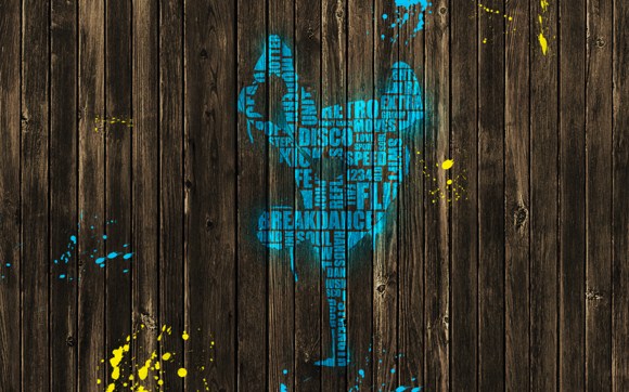
Typography Art – Break Dance
This tutorial will guide you on creating a typographical piece of art again. But this will be on a whole new level. The project is very inspired on break-dancing moves thus; you will need to download a silhouette of break dance moves. Also you will need a wood texture which is easy to find in free stock images sites.
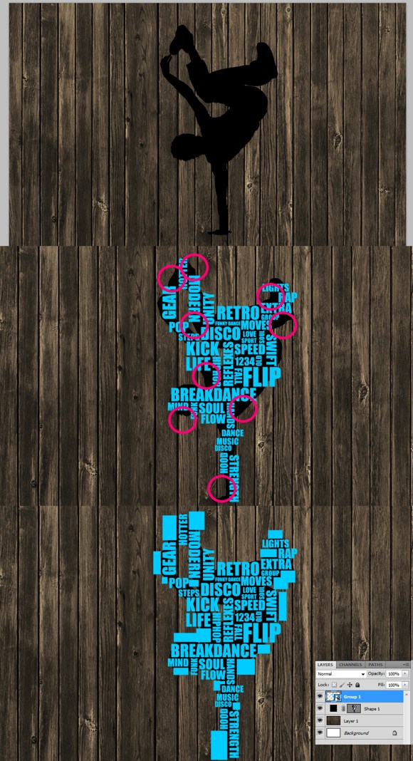
First open up the wood texture you have prepared. Now import or insert the break-dance silhouette. In some cases, the silhouettes that available on the web are in vector format which can only be accessed through vector programs such as Adobe Illustrator. You will have to look at some other guides on how to import vector files to Photoshop.
Now choose a preferred color. This will be your main paint and text color. Select the type/text tool. For starters, choose the font ‘Impact’ as the font to be used. You can use a variety of font types; however keep in mind that using solid fonts and sans-serif fonts are much better to look at compared to types with rounded edges, cursive or script type, handwritten or fancy, and serif types.
Starting putting some texts related to a topic such as break dance. Layout the text using varied sizes and positioning. Some texts are in horizontal while others should be in vertical position. It is ok to have texts that overlap the edges of the silhouette. Next, notice those areas where it is too small to fit in more text, these will be the areas where you are going to put boxes using the shape tool. Filling up the gaps should make the figure more defined than leaving the gaps alone.
Once all the box shapes and text have been arranged properly, create a group for these objects. Or you could select the text + boxes and convert them to a smart object (right click on the selected layers and convert them all at once to a smart object).
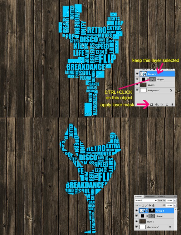
I assume that you have already created the smart objects for the texts and boxes, so let us proceed to masking. Select the text/box layer, then on the silhouette layer press CTRL+CLICK on the shape, marquee selecting the silhouette will automatically show up. Then click the create mask which is found on the bottom part of the layers palette. Make sure when you create the mask, the text/box layer is active or selected otherwise it will apply the mask on another layer.
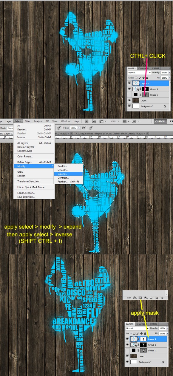
Ok, next is to create a new blank. Set the foreground color to match the text color (cyan/blue). Find the spray paint brushes which is included in the default brushes of Photoshop. You can also download ‘spray paint brushes like the ones I used here for our tutorial. You can find and download the brushes for free in Photoshop resources web communities.
Now CTRL+CLICK on the silhouette layer again. Go to select > modify > expand. Expand the selection by 1 single pixel. After expanding it, go to select > inverse or simply press SHIFT+CTRL+I. After the inversion, apply a masking layer by pressing the add layer mask icon found on the bottom area of the layers palette.
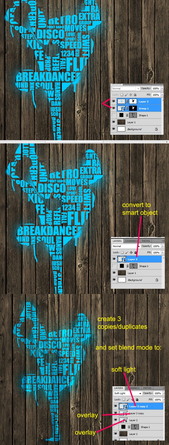
Select the spray paint layer and the text/boxes layer. Right click and then convert these layers in a single smart object. Create 3 copies or duplicates of this smart object. The set the first or original smart object to overlay blend mode, then the second to overlay again, and the third to soft light.
And that’s it. I hope you enjoy learning with this tutorial. Do not forget to save your work.
Have fun with this one, you can create a lot of cool images once you master this. As always, feel free to ask questions or share your creations with us in the comments.
Show Off Your Photoshop Magic by Creating this Flaming Playing Card
This Photoshop tutorial will show you how to create a realistic playing or poker card using premade vector shapes and the rounded rectangle tool in PS. Also, we will be creating a popular Marvel mutant skill of the pinkish flaming cards of Gambit.
First and foremost, open up your favorite browser. Search for ‘flame/s’ or ‘fire’ free stock photos. You cannot just get it anywhere so it is a good idea you search it first at free stock photo sites and communities. I got these fire images from a stock photo provider from DeviantArt community.
Now, once you have the required stock photos, open up a new document in PS. Resolution and aspect is not that really specific but, I would recommend using 1500px or more as width and a 1200, more or less, for the height.
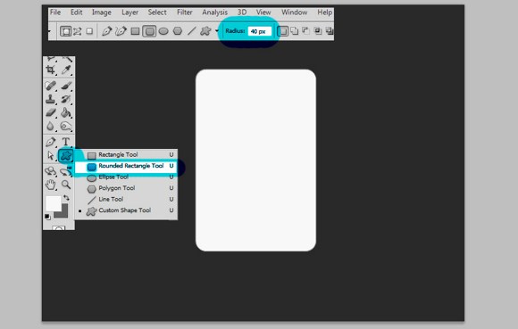
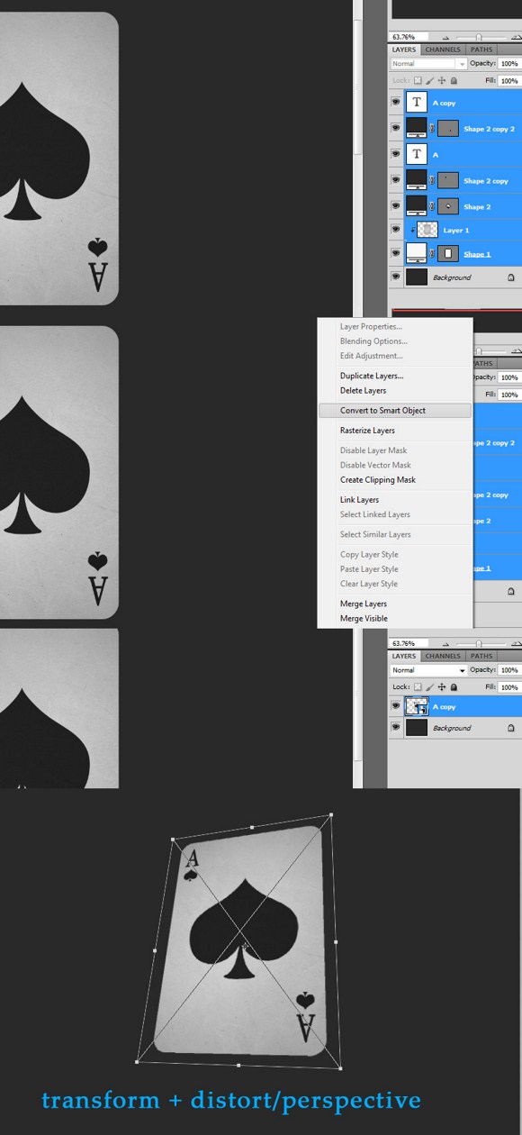
Here we have a landscape document with a dark gray background. Next, select the shape tool (right click to see more options) and choose the Rounded Rectangle shape. Create a white rounded rectangle on the middle area. This shape will be the card that we are going to work on later.
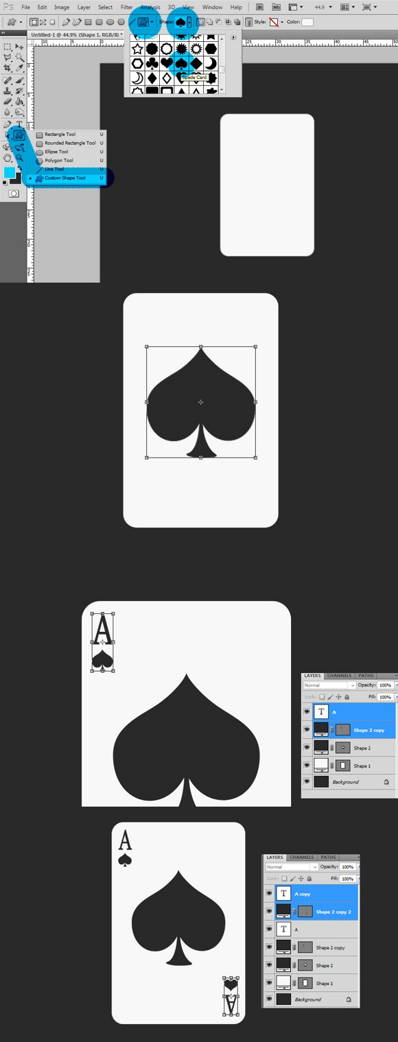
Next, select the custom shape option under the same tool. Right click the current custom shape tool, and then choose the last icon (one with the undefined shape). Now on the top area of the screen, there should be a panel where you can choose premade shapes like the card spade.
Choose that shape and then draw or make the shape on the card. The shape will automatically create a separate layer for itself. Use the transform tool to resize and relocate the shape to the center. You can use the background color which is dark gray for the color of the spades and letters. Use type tool to create the letters.
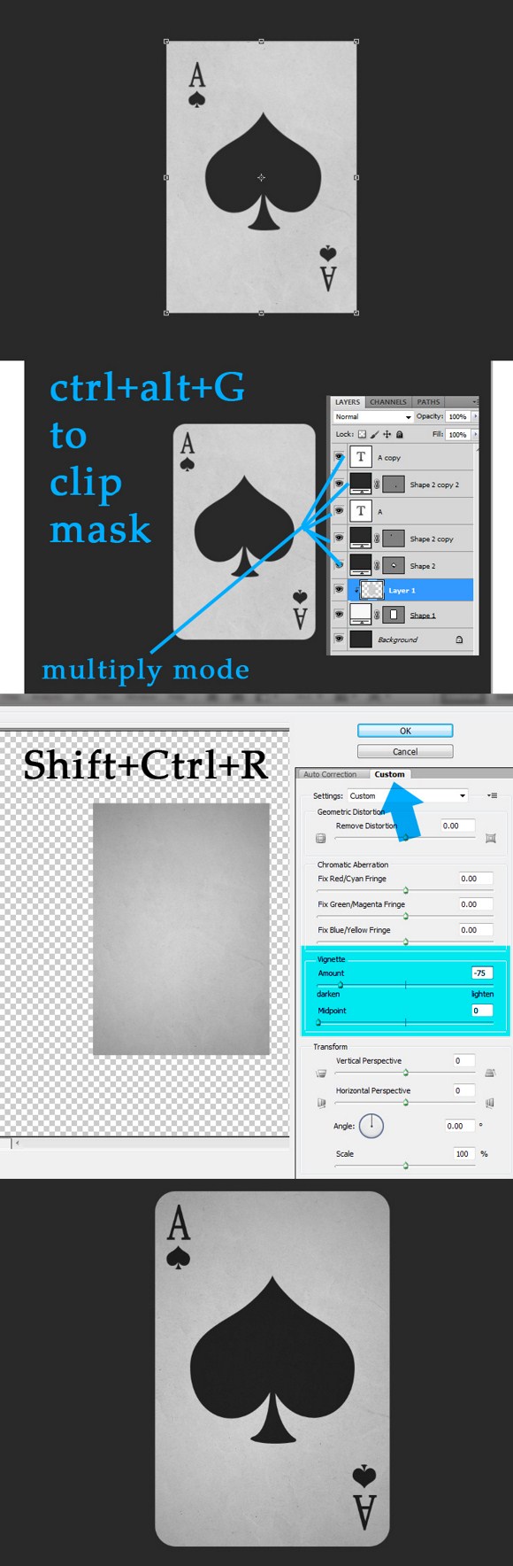
Now download a paper texture. Import the texture and place it just before the card shape layer. Press CTRL+ALT+G to clip this texture to the card layer. Make sure you resize/transform the texture slightly larger than the card.
Set ALL the layers EXCEPT for the background, the texture and the card layers to multiply layer blend mode. Now on the paper texture layer, Press SHIFT+CTRL+R to open the Lens Correction. Click the Custom panel. Now on the vignette area, input -75 (minus/negative 75) on amount, and zero (0) midpoint. Apply changes. Please see the example below for the results.
Next select all layers except for the background > right click on any layer > then click Convert to Smart Object. After creating the smart object, use the transform tool > perspective or distort tool to make the card look like in the example below.
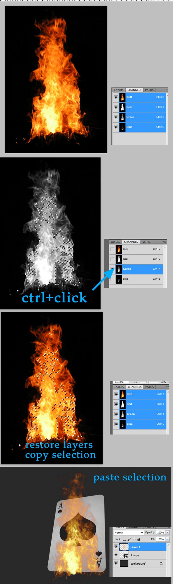
Open a flame photo in PS but separate from our project. Go to channels (located beside the layer tab). Hide all layers except for the Green Channel. CTRL+CLICK on the green channel.
Next, unhide the other layers and select RGB channel (it also selects all the channels). Go back to the Layers tab. Then PRESS CTRL+C to copy the selection. Now on the main project/document, press CTRL+V to paste the selection. After pasting, press CTRL+D to deselect.
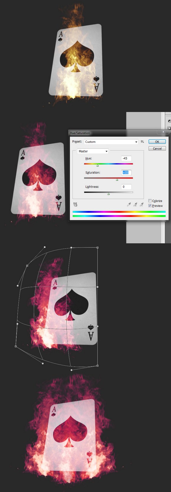
Select the flame layer. Set it SCREEN Mode. Go to adjustments > hue and saturation > and adjust HUE parameters to get pink flames. You may have to create duplicate or use other flames to intensify the project.
Press CTRL+T to transform the flame layer >right click on the box and select warp. Use your creativity to cover the card with flames. Again you will need to duplicate the flames to cover the whole card.
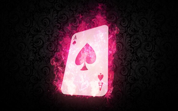
Bonus: create a duplicate of all flame layers > go to filters > blur > Gaussian blur [30px] > and set the blurred layer to screen mode. This will enhance the flames appearance.
Now that is how it basically done! Pimp up the final result by adding some wallpaper background, drop shadow effects, and glowing effects (which have been taught in other tutorials in this site).
Creating the Comic Book Visual Style Effect
This tutorial will guide you how to make an ordinary photo into a comic styled image. Comics usually have their distinctive halftone effect and heavy edges. This tutorial will be a little bit confusing so strap yourselves up and get pumped up for this comic visual effect project.
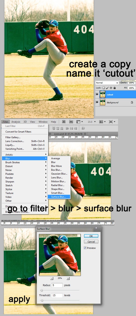
First you need to have a good picture to work on. Landscape scenes will be very good with this effect, so use photos with people in it. Here, in our example we used a picture of a teenage boy about to pitch baseball.
Open and image in Photoshop. You may also need to resize you image to about 2000 pixels in width to match your image resolution to the resolution used in our examples.
Duplicate the original layer of the image and rename it to ‘cutout’. On the cutout layer, go to filter > blur > and select Surface Blur. Use 5 pixels as radius and enter 15 in threshold. Then apply the effect.
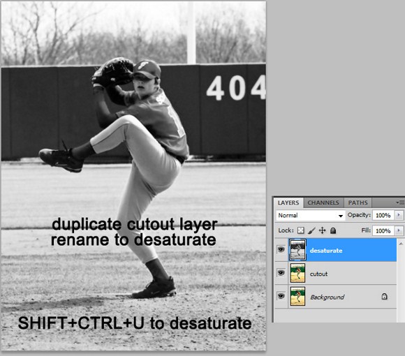
Next, duplicate the cutout layer. rename this layer into ‘desaturate’. To make this layer in black and white or desaturated, press SHIFT+CTRL+U.
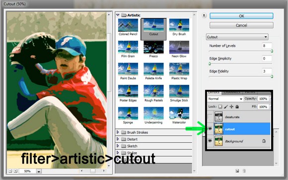
Now, hide the desaturate layer temporarily by clicking the eye box beside the layer. SELECT the cutout layer as the active layer. Go to filter > artistic > then choose the Cutout effect. Use the following settings: number of levels = 8; edge simplicity = 0; edge fidelity = 3. Do not forget to apply the filter effect by clicking ok button.
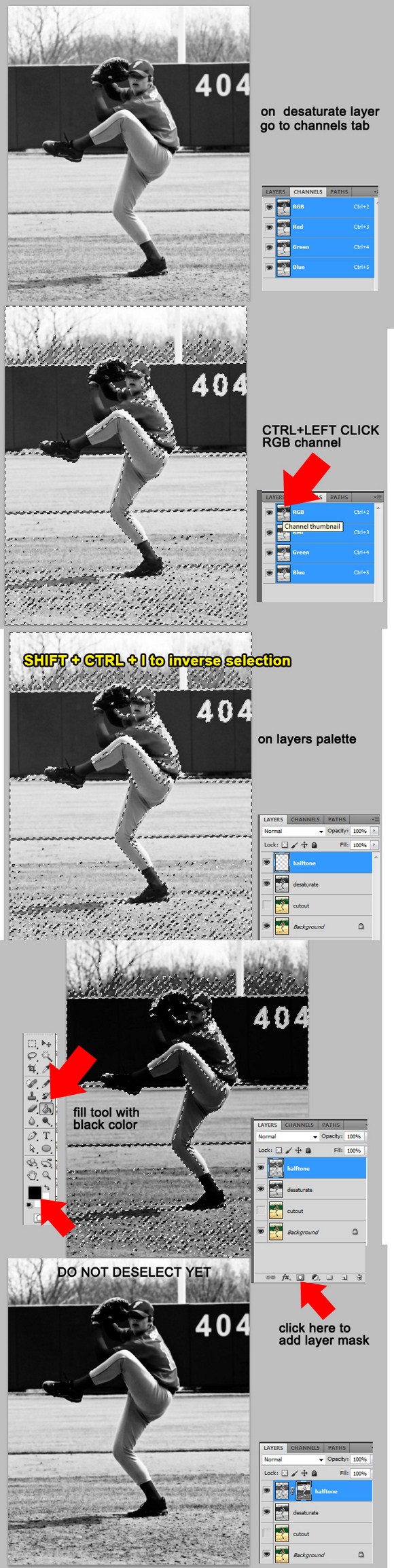
Now select the desaturated layer as the active layer (unhide it first). Pay attention because this might get topsy-turvy when you are unable to follow closely. Now go to the channels tab. You will find next to the layers tab located in the same palette. You find several channels. Focus on the RGB channel. Press CTRL+LEFTCLICK on the RGB channel to select the brightness of the channel.
Now back to the layers tab, create a new layer and name it ‘halftone’. Be careful not to DESELECT the active selection yet. Before proceeding, press SHIFT+CTRL+I to invert the selection (this will select darkness instead of lightness of the image). Now use the FILL tool with BLACK color and fill the halftone layer with the selection still active. The whole image will seem to darken but leave it be.
With the selection still active (on the halftone layer), click the add layer mask button which can be found on the bottom part of the layers palette. See image below to locate the button. After creating the mask, the selection will automatically gets deactivated so do not panic.
Now back to the desaturate layer, apply a filter effect called poster edges. Go to filter > artistic > then select poster edges. Use the following settings for this effect: edge thickness = 1; edge intensity = 1; posterization = 1. (Effects may vary depending on the resolution). After applying the filter effect, change the desaturate layer’s blend mode to PIN LIGHT.
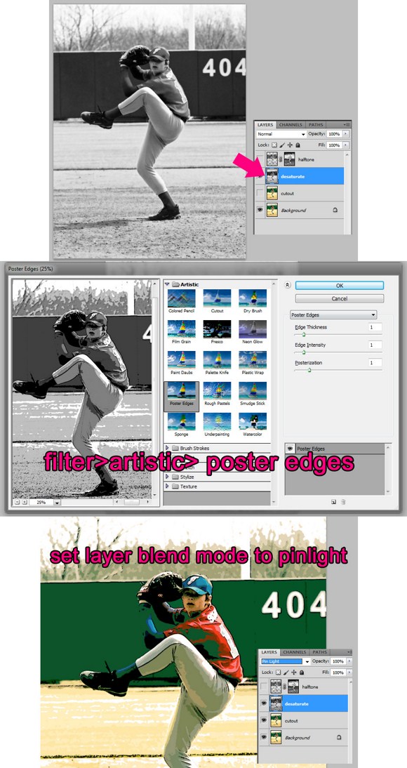
Next, back to the halftone layer. Select the LAYER MASK, not the layer itself. Now while the mask is selected, go to filter > PIXELATE > then select Color Halftone. You may use the default parameters, but if you are not sure, use the following properties: max radius = 8; channel 1 =108; channel 2 = 162; channel 3 = 90; channel 4 = 45. And apply the effect. Lastly set the layer blend mode to overlay.
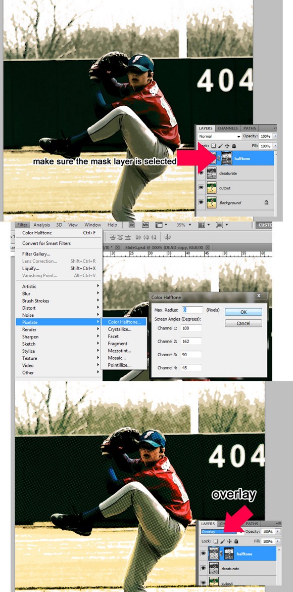
And that’s it. You have already done the comic book visual style. You can add some comic style dialogue balloons and borders to make it look like it was actually a comic magazine issue!
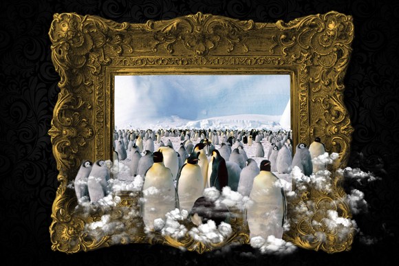
Painting Comes to Life Part 2 – Create a Magical Penguin Land in Photoshop
We may have already a similar effect and tutorial for this on the same site, but I would like to share a much magical and complicated procedure that surely offers a more convincing final output. This project will cover channel manipulation and tremendous amount of masking and cut-and-copy routines. All you have to prepare and download before starting is images of classic or old painting frame, a free photograph of penguins, and lastly a free stock photograph of aerial shot clouds.
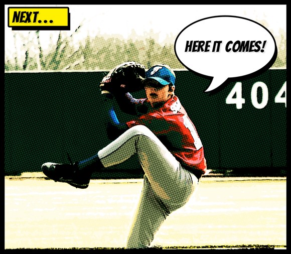
Once you have all those stock photos required, you are ready to start the project. First, create a landscape oriented document and import the frame image to it. Use a black background color for this project.
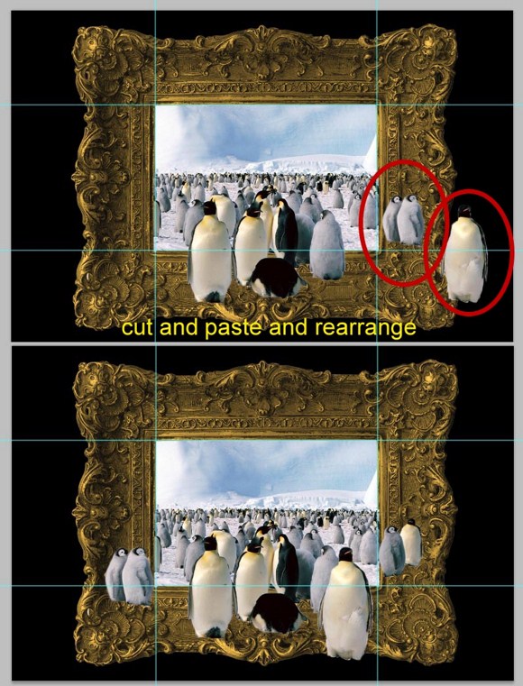
Place or import the picture of penguins you have downloaded. If photo needs enhancement (example, contrast and colors), you will have to do it in a separate document. Place the penguins above the frame. Arrange them in the layers palette.
Now this part might be pretty tricky. The goal is to place the penguin layer perfectly so a certain part will become aligned with the frame’s center. I know it is quite complicated and confusing; you may want to view the image below on how I placed the penguin layer. Reducing the layer opacity helps you to see through objects, so it helps you arrange the layers. Rulers and guidelines (the cyan colored lines you see on the images below) will also help you know where the frame borders are located.
After placing the objects where they should be, proceed on REMOVING the areas outside the frame except for the penguins located in the foreground. You can use Marquee, Eraser, or Masking tools and techniques on removing the unnecessary parts. Do not forget to restore the opacity of every layer.
After the removal of the unnecessary areas, create a duplicate layer of the penguin layer for backup purposes and hide it. We may need it in the future. Look at the image below. You will see that some of the penguins have been relocated. Also if you look closely, there are penguins added. Use cut and copy to achieve this. You will have to do the free transform tool and the invert horizontally tool to add smaller and larger penguins.
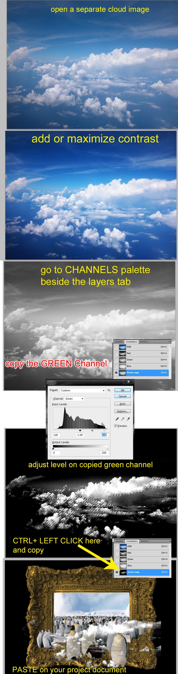
Now on to the next step: adding clouds. Open a downloaded cloud image in Photoshop. Sometimes the quality and contrast of the clouds is too faint so we have to alter using the adjustment tools. In my case I have to maximize contrast, which is needed most of the time.
After improving the contrast, go to the channels palette which is just beside the layers palette. Duplicate the Green Channel. You will also have to hide all other layers which leaves on the GREEN channel copy visible. On the green channel copy, press CTRL+L to bring up the adjust layers panel. Play and learn how the parameters work. Get a result similar to the image shown below.
Next, press CTRL+ LEFT CLICK on the edited green channel, and COPY (CTRL+C). Paste the clouds on the main project. Place the layer on the topmost position. You may set the layer blend mode to screen or not.
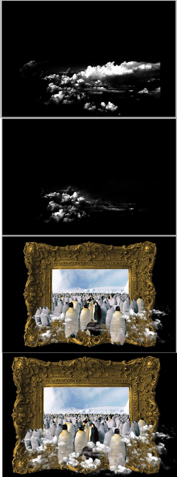
After you have placed the clouds, it is time to do modifications. You may want to hide other layers so you won’t get confused with the cluttered screen. You will have to remove some parts of the clouds which are not needed. Use the eraser tool carefully to remove areas.
Repeat the steps above (the channel stuff) to add more clouds. You can also copy clouds and reshape or free transform copied clouds to create a variety of clouds. Arrange the clouds accordingly and neatly where they could also cover the feet of the penguins on the foreground.
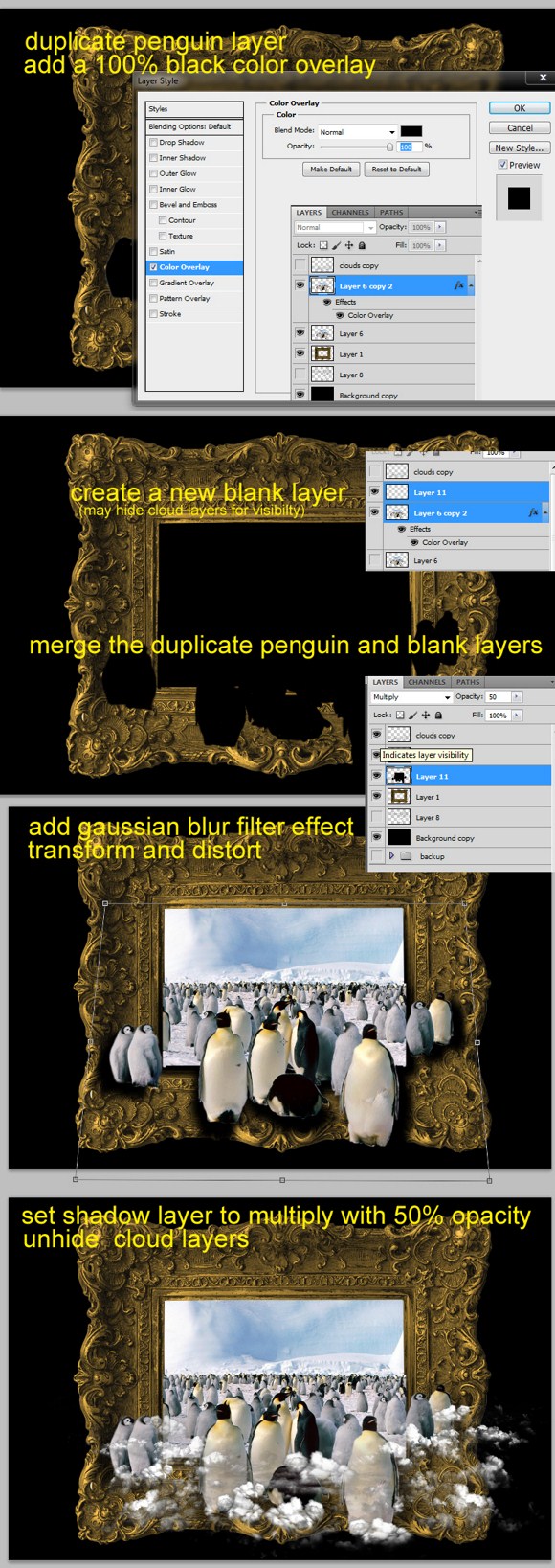
Lastly, is adding the shadows. Duplicate the penguin layer. Put a COLOR OVERLAY effect on it using black. Next, go to Filters > Blur > Gaussian blur, and use a radius of 6-8 pixels (depending on the overall resolution) and apply. Create a blank layer and merge it with the black penguin layer. This will be the shadow layer. Do not forget to place below the original layer.
Free transform > Distort the shadow layer and reshape it to tight trapezoid shape. This will simulate a real shadow. Lastly set it to multiply blend mode and set it to 50 percent opacity.
That is all there is to it. Go ahead and add background texture and apply any other personal touches you like and you will have a great looking image.
As always, please feel free to provide feedback and share with us in the comments.
Be Constructive and Not Destructive in this Photo Editing Photoshop Tutorial
For a long time already, we have been enhancing and altering photographs using the settings found on Image > Adjustments. This method is what we consider as the destructive method of editing photographs and images. we may have also discovered a way that could prevent accidental manipulation or changes done upon a certain photo by making a backup copy of it located on another directory, or we made a duplicate layer of that photo and hidden on the same Photoshop document (*.psd file).
Well it is also good to secure a backup copy of the picture when starting to edit, however, sometimes we are in a hurry that we forget to make a backup of that image and proceed editing leaving you without a raw copy of that image. Plus, we cannot also create a backup copy of that photo especially we have only a limited memory left. This is very bad news in case we do not come up with a desirable edited photo.
Another disadvantage on having a duplicate layer of the original photo is that the file size of the saved Photoshop Document is pretty large. This is caused by the memory occupied by the duplicate image layer. However, by using adjustment layers, we do not have to create a duplicate layer and hide it. The adjustment layers covers or alters the normal layers under it. The advantage of using adjustment layers on editing is that the changes done on the photo is NEVER permanent UNLESS, we FLATTEN the image.
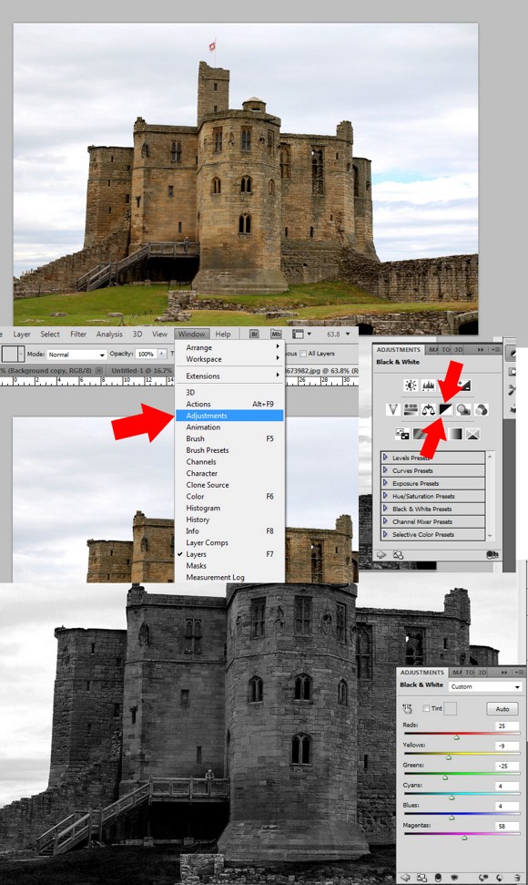
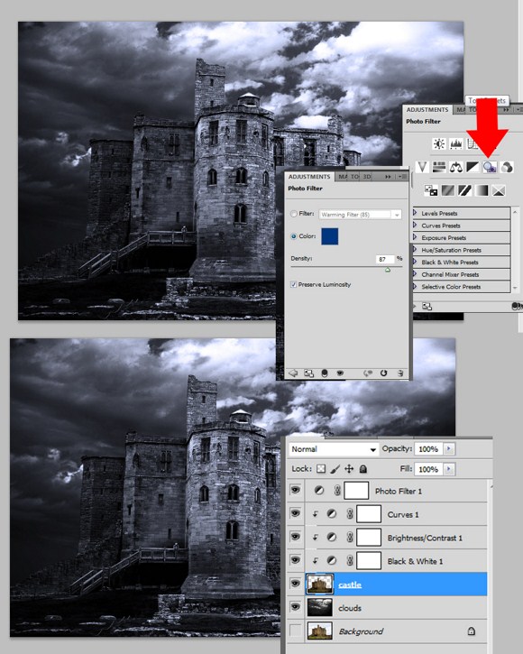
Now this tutorial will show you a few tricks in using the adjustment layers. I will not be able to demonstrate all functions we might be able to use but I will show you one of the most wanted techniques used to enhance a dull photo. This project is about enhancing a photo of a castle with dynamic lighting and improved details and shades.
Here we have a photo of an old medieval sort of castle which I downloaded from a free stock photo site. To access and add an adjustment layer, go to window (next to the view tab) or the icon (black and white circle) found on the layers palette , and you will find the Adjustment layer sub-menu or option. You will find a palette of square shaped icons. First, we will choose the Black and White Layer. Once we have added the adjustment layer for black and white, the image will convert to grayscale, and also you will be able to adjust the color channels to achieve better details. (For this image I slightly reduced the blue, cyan, green and yellow.)
Alternatively, you can go to Layers > and Add New Adjustment Layer > Black and White to access the same effect.
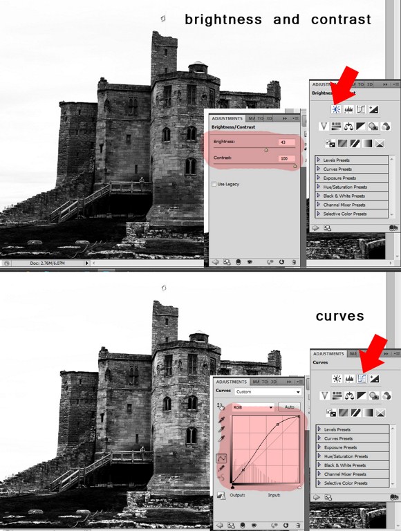
Now you already know how to add adjustment layers, let us try a few more adjustment types. Let us add the Brightness and Contrast and the Curves Layer. Add brightness and max out the contrast. Next add the curves adjustment layer, follow the curve as seen below. You will notice that this has the same effect as to adjustments on the actual photo layer, but this method gives you more control and options and of course, it is safer. Note, that you can also apply layer blend mode (example: overlay) to adjustment layers. Try it to see how it works.
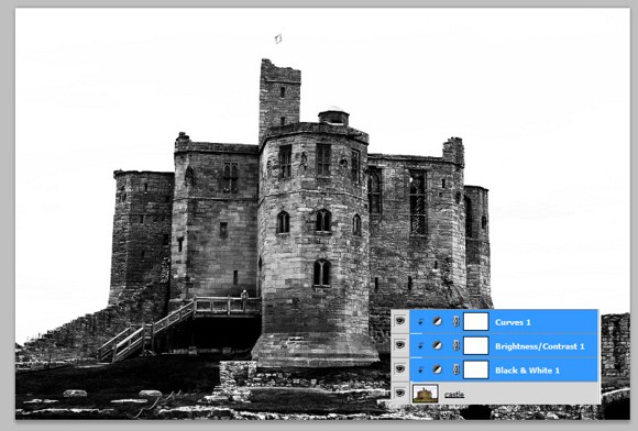
Select the 3 adjustment layers and press ALT+CTRL+G to create clipping mask.
Now let’s try removing the background (using marquee tool) and import a separate photo of clouds. I imported a cloud image (edited contrast beforehand), and placed its layer under the castle layer. On the castle layer I applied spotlight lighting effects (filter > render > lighting effects).
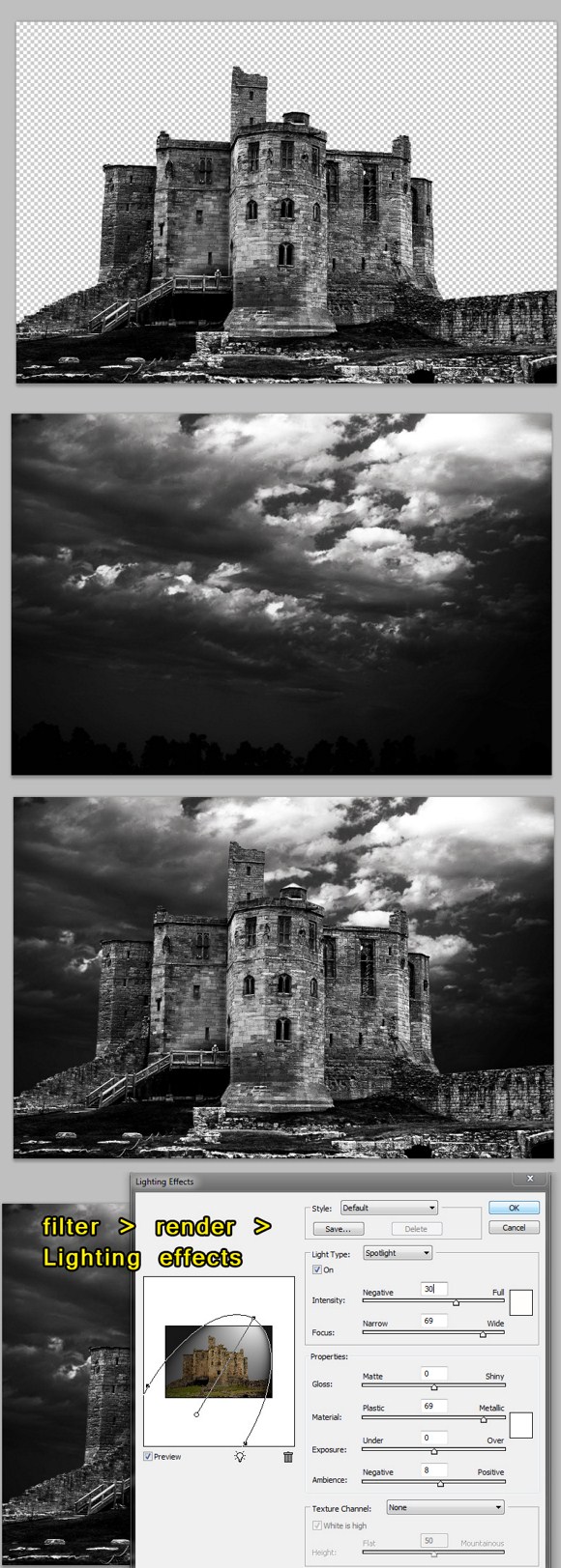
Lastly, add the PHOTO FILTER adjustment layer and choose a cool color (blue). Remember that this adjustment layer is not a clipping mask. See the image below to be guided on the arrangement and properties of the layers.
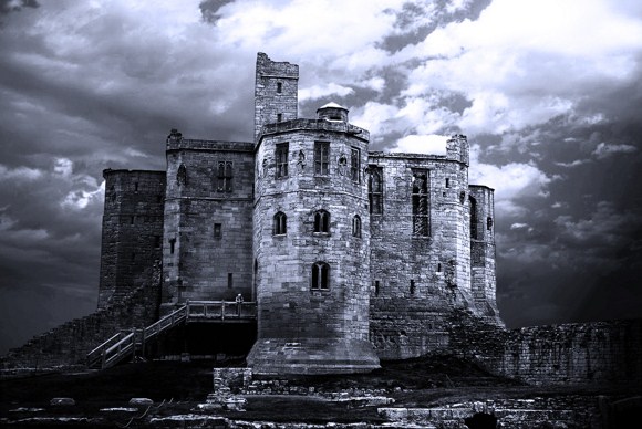
And that’s it we have now our final result. Using adjustment layers to edit photos is a good practice. Save the final image as a jpeg file, while you save the PSD without flattening the image, for future editing.
If you have any desire at all to be a graphic designer this technique is definitely one you want to master. We hope you enjoyed it and as always please feel free to share your creations with us in the comments.
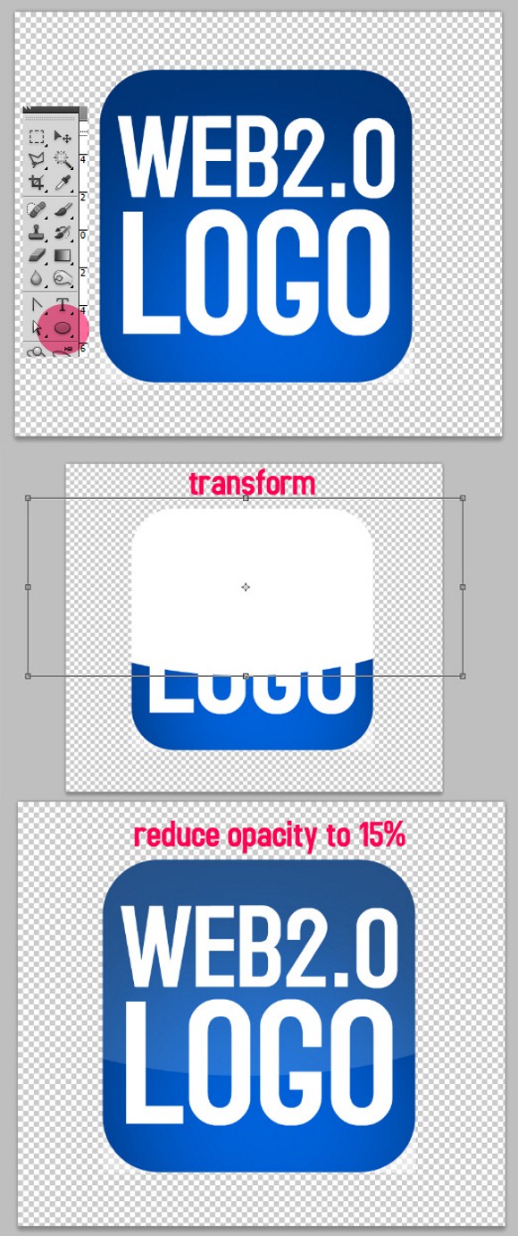
Polish Your Website with this Web 2.0 Logo Tutorial
The term web 2.0 graphics has no proper definition. But so far, as we have throughout the entire Internet, have seen those glossy graphics, shiny 3D buttons, logos, bubble like icons. All have a common factor which is the distinctive shine or gloss, and the 3 dimensional illusion bubble effect. In this project and tutorial, the words shine and gloss will be greatly overused.
To create simple web 2.0 buttons or icons, you need to have first a logo. Well that is obvious. This part is where you will learn how to make simple flat buttons and icons in to a bubble effect with gloss. For now we will have to use simple shapes like rounded rectangles and solid texts.
For example, I have an existing logo of an unnamed product. The logo is a rounded rectangular icon. Find and click the ELLIPSE TOOL (hotkey = U, right click to expand and use ellipse tool) found on the tools palette. Select WHITE color as your foreground color.
Now create a large and very oblique ellipse that is enough to cover the half of the entire logo. Press CTRL+ALT+G to clip mask the white ellipse to the logo. You may have to use transform tool repeatedly to make the ellipse symmetrical or balanced. After that you may change the blend mode of the ellipse to screen mode. And the last step, the most important, is REDUCING the Opacity of the ellipse to about 10 to 15 percent. This will give the simple shining illusion of the Web 2.0 icon.
I will give the detailed steps on applying shine or gloss effects on word-only or text only logos, and circular objects. The following steps will also show you the making of other simple glossy web 2.0 styles.
The same principle is used on word or text logos as shown above. Applying a drop shadow and shadow effects are also widely used. Now, let say we have to create a text logo from scratch, so first we need to create some simple text.
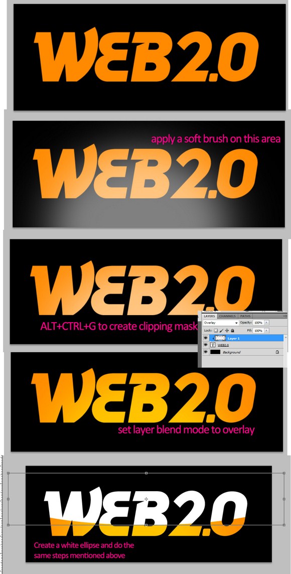
Although it is good to apply this effect on single colored text, it can be also used on certain type of multicolored logos. Now using a large soft brush reduced to at least 50 percent opacity, paint a faint glow near the middle area. Press CTRL+ALT+G to create clipping mask. And change the layer blend mode to overlay mode. Now proceed to create the gloss effects using the same steps used on the earlier part.
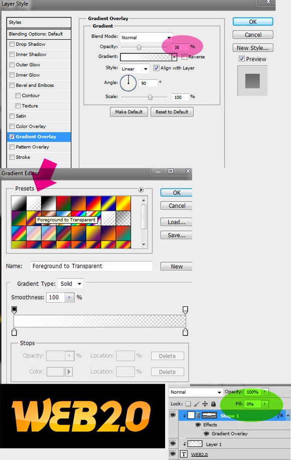
But wait! Do not REDUCE the ellipse’s opacity! Instead apply a gradient overlay on the clipped ellipse.
RESET the foreground and background colors to default black white (hotkey = D).On the effects option panel, reduce the opacity to less than 40 percent. Choose the preset gradient named as FOREGROUND TO TRANSPARENT. Lastly, REDUCE the FILL (not the opacity) to ZERO percent (0.00%). Look at the effects you have made! Do not also forget to hide the dark background when saving for web.
Now you may have also observed that many logo designers use the WEB 2.0 effect on their work. Although solid and flat color work on many types of logos, still having a well made glossy effect will greatly improve visibility, depth, and overall visual impact of the logo.
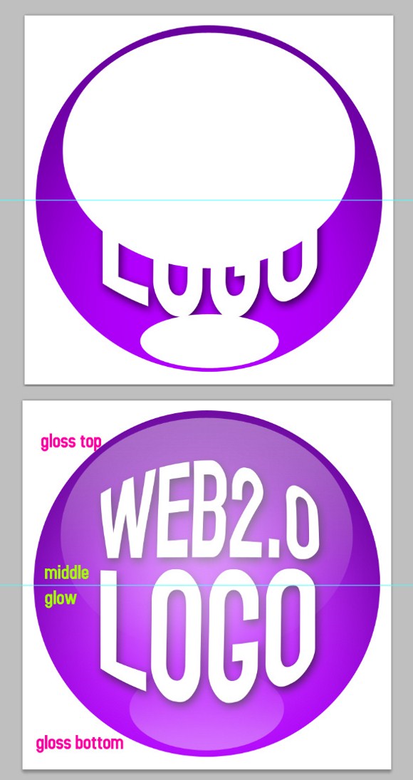
Here are some few more tips on creating the web 2.0 effect. A round logo is one of the most popular logo shapes to be made with the glossy effect. Even windows start button have this kind of look. What we here below is a circular logo enhanced with the glossy effect. As you can see, there are 2 ellipses applied onto the logo. And again, we need to apply the same steps mentioned earlier. On round logos, you will notice that the bottom gloss gradient overlay is in opposite direction with the top one. Also we have added a faint large glow on the center. You will hardly notice it at first, but later on you will realize it does a heavy impact on the visual aspect.
There you have it! I hope you enjoyed this tutorial and remember to share your feedback and ask any questions you have in the comments.
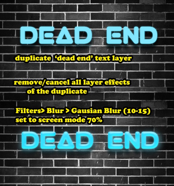
Improve Your Skills and Avoid Dead Ends with this Photoshop Tutorial
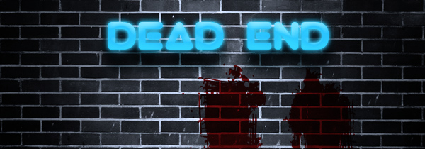
This tutorial will show you the steps to compose a dark, gloomy, and spooky background with a distinctive neon sign at a dead end. Basically, it is a composition using two techniques in Photoshop namely the Neon Lights effect and Creating a Wall Landscape. Combining these techniques can create many dark themed scenes with the help of textures, lighting, and some spooky brushes.
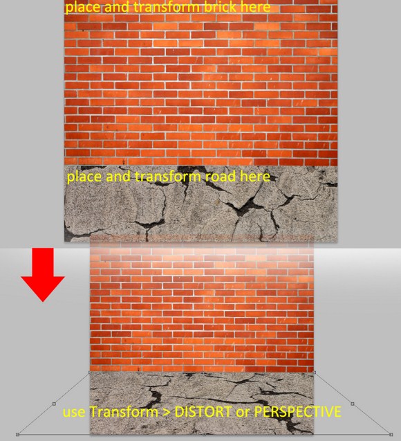
First, you are going to need some downloaded stuff before you can start on the project itself. The first image you are going to need is a brick wall texture. Search for good images on Google using keywords like brick, wall, and texture. I am pretty sure a large red brick wall would appear on the results.
Download secondary textures like “road textures” or “scratched textures”. Next, find some ROUNDED thick fonts form sites like “Urbanfonts” or “Font Squirrel”. For example I have to download a type face named VIRGO which is quite thick and rounded. The reason we need these rounded fonts is because we are going to imitate how a neon sign looks like.
Now, on to the project, create a document (I guess, you will have to estimate on this one), and import + place the brick wall texture just like on the image below. Leave some space blank as allowance for the ground texture.
Import the ground texture you got. This time use the Transform tool (hotkey = T) and use DISTORT or PERSPECTIVE functions (found within the transform tool) in order to reshape the ground as seen on the image below.
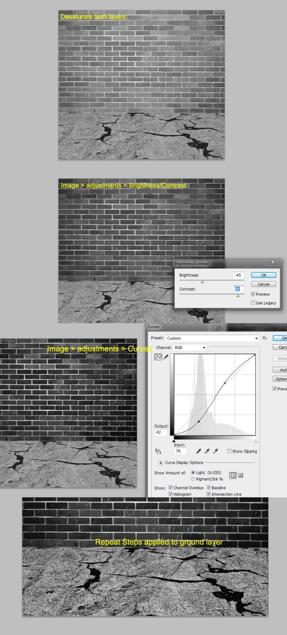
Next, DESATURATE (SHIFT+) BOTH layers. I know, there are more effective ways to do black and white images like the adjustment layers method, but for the sake of simplicity and to avoid confusion especially in the layers palette, we will do this in a NEWBIE way.
On the brick wall layer, go to Image > Adjustments > and find Brightness & Contrast. Reduce Brightness and increase Contrast significantly. Next, Image > Adjustments > Curves, and try to follow the curved figure you see in the image below. Apply to the floor/road layer the same steps with minor changes in the adjustments.
Merge the two layers, Brick wall + Ground layer. Although merging these layers is not essential, it will help to simplify things especially to those who are now getting confused on the stuff in the layers palette. The fewer the layers, the simpler it becomes to follow.
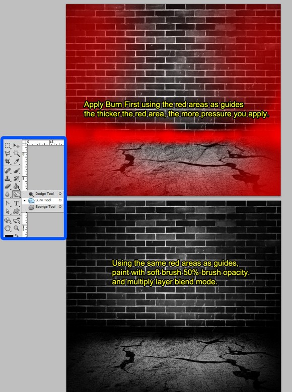
It is important you do this in order. First, Activate or click on the BURN TOOL (hotkey = O).set the burn brush opacity to 40-50 percent. Look at the image below. The RED areas are your guide where o apply the burn tool. CHANGE the RADIUS as you burn the areas. You may have apply twice or thrice on some areas to make it darker than the center area.
Create a new layer and SET it to MULTIPLY layer blend mode. Using the same “red guides”, apply a soft 50 percent opaque BLACK painted brush over the side areas. This will create the appearance of a dark alley or street dead end with light coming from the center.
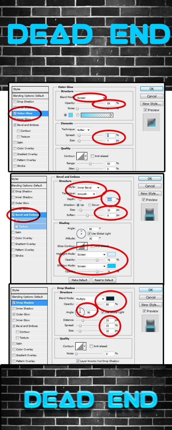
Create a text. Write anything using the VIRGO font. Or anything that is close to an actual neon light. Apply these 3 layer effects. Use following approximate settings:
OUTER GLOW:
Blend mode = screen,
Opacity = 50-60,
Color = light/sky blue,
Spread and Size = both 7 %
BEVEL & EMBOSS
Style = inner bevel,
Technique = smooth,
Direction = UP,
Size = 15 pixels,
Soften = 5-8 pixels
Highlight mode = screen, color = bluish white,
Shadow mode =screen, color = a lighter sky blue (lighter than the base color)
DROP SHADOW
Blend mode = Multiply, Color = very dark blue,
Opacity = 80 %
Distance = 25,
Spread = 15,
Size = 20
Duplicate your text layer. Disable or remove the existing layer effects. Go to Filters > Blur > Gaussian blur and apply 10-15 radius. Set this layer to screen blend mode with 50-70 percent opacity. This will give the additional glow.
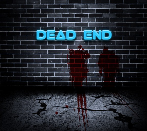
Next, go to layers, Add new ADJUSTMENT LAYER (you will need this in this in the future), and choose PHOTOFILTER. Pick aqua blue as color, and set Density to about 60 percent.
And for the last cosmetic step…blood. (Am I getting too fond of putting blood to the works?) if you still have the SPLATTER brushes, load them up and set your foreground color to blood red(again). Paint anywhere on a new layer (place the layer just before the wall layer afterwards), and set the blend mode to multiply. You may use cutting and transforming techniques to help to blood look convincing.
That is it. Pleas ask questions and share your work in the comments.
Show Off Your Photoshop Mastery with this Awesome Engraving Tutorial
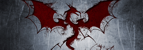
Today’s Photoshop tutorial is going to be an engraving effect on solid steel. The effect is inspired from the movie poster of the action sci-fi film PANDORUM. But instead of using unfamiliar alien symbols and the same visual quality, I am going to show you how to recreate the effect with better texture and contrast, and of course, using a dragon figure to make it look like a medieval inspired composition.

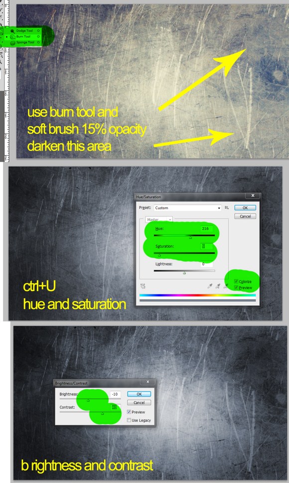
So, the first steps you need to do are to prepare your Photoshop document. Use your maximum screen resolution as your document resolution. In this way we can use the final output as our own desktop wallpaper. Open up Google search, and look for Large Sized images using keywords like steel textures, metal textures. You need to download TWO(2) large sized images for this project. Next, search for images of dragon shapes using keywords like “dragon + silhouette”, “dragon symbol”, or “shape”. I am certain you will find large images for this category. Also, download set of Photoshop Brushes(*.abr files) namely “Cracked Edges Brushes” from DeviantArt community from ~wyckedBrush. So in summary you need 2 steel/metal textures, a silhouette or symbol of a dragon (preferably in solid white background), and a set of Cracked Edges brushes.
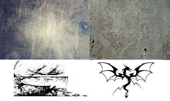
On the first metal texture, you may see uneven shades or areas where parts are lighter than the rest of the image. Use Burn Tool (hotkey O) in COMBINATION with a soft brush in color Black, preferably in 10-10 percent brush opacity.
Open the hue/saturation adjustment panel (hotkey CTRL+U). Enable colorize, adjust the hue parameters until you get a soft bluish wash. To weaken the blue factor, just reduce the saturation levels. Lastly, reduce the brightness a bit and add more contrast. Brightness and contrast is found in Image > Adjustments.
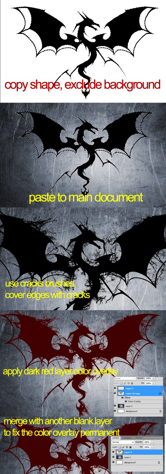
Open the dragon silhouette or shape. Cut and copy the dragon figure excluding the background. This explains why images with white background are easier to manipulate. Paste the copied shape to the main document over the metal texture. Load your cracks brushes and apply cracked areas along the edges of the shape.
Next, MERGE the CRACKS with the DRAGON shape. Be careful not to merge it with the background metal or the default background and anything else. Once merged, apply a layer style, the color overlay with a blood colored red. The fix the color as base/permanent color of the dragon, create a blank layer and then merge it with the dragon shape. You will see that the image is still in red but without layer effects.
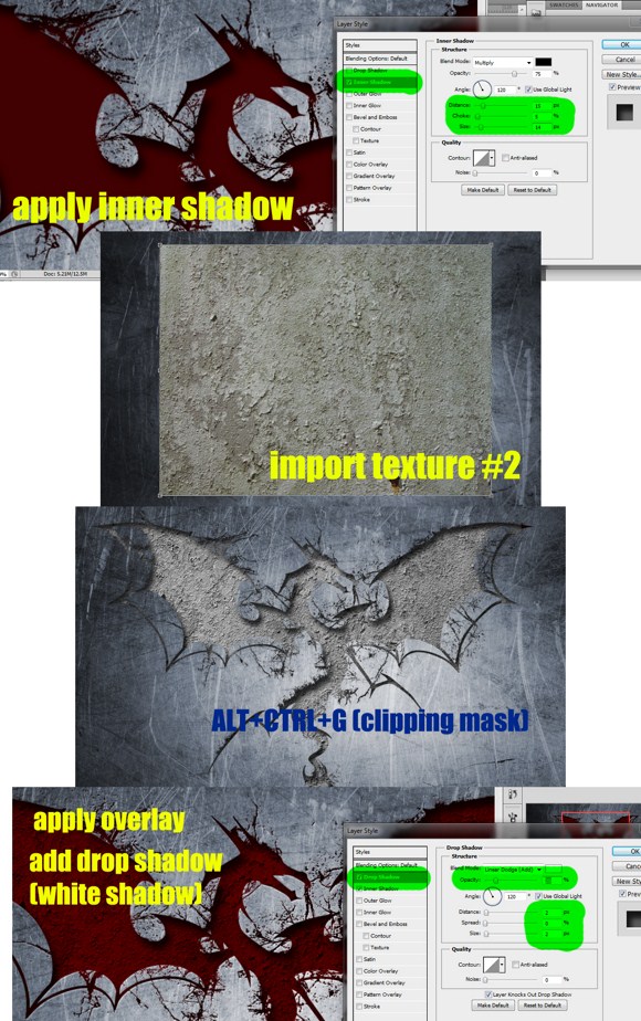
Next, on the red dragon layer, appy a layer effect called inner shadow, choose black as shadow color, set distance to about 15 pixels, choke close to 5 pixels, and spread to about 15 pixels. Apply the effect.
Import the second texture you have prepared. Place the texture in accordance with the location of the dragon. Make sure the dragon shape is covered under the texture. Press ALT+CTRL+G to create a Clipping mask to the dragon. This trick will make the texture only applicable to the dragon layer. set the layer blend mode to overlay, viola, you now have a red textured dragon engraving.
To make the engraving much more realistic, apply a drop shadow on the dragon layer. but instea of using black color as shade, we will USE the WHITE color with LINEAR DODGE(add) as the blend mode. Set the distance to 2 pixels, choke to none or 0, and spread to 2 pixels again.
There you have it. You have already made yourself a cool personalized engraved wall paper. Note that you can also apply this effect on RASTERIZED text object. Feel free to try other shapes other than the dragon.
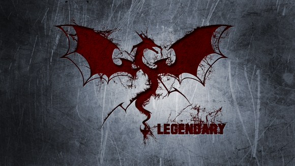
There you have it. Remember to share your work or questions in the comments.
If You Have a Passion for Design Check Out this Cool Bleeding Photo Photoshop Tutorial
Let me share to you a simple trick in Photoshop where we create a badass antique looking portrait painted in blood. Speaking of blood, this tutorial does not involve any gore actually. Well, except for the name we call it. The final output seems similar to the loading screen we find in Dragon Age Origins PC game. This Photoshop effect is also known as the bleeding watercolor effect. So, here you go folks.
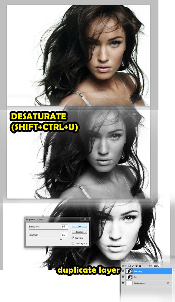
First thing to do is to find and download a picture of a person. In our example, I have downloaded a picture of Megan Fox with white background. I suggest you secure a photo with white background to try this effect.
Import the picture to your widescreen format document. You may have to resize to fit the picture. Press SHIFT+CTRL+U to DESATURATE the picture. Go to Image > Adjustments > then adjust the photo to achieve a high contrast picture. After that, duplicate this layer.
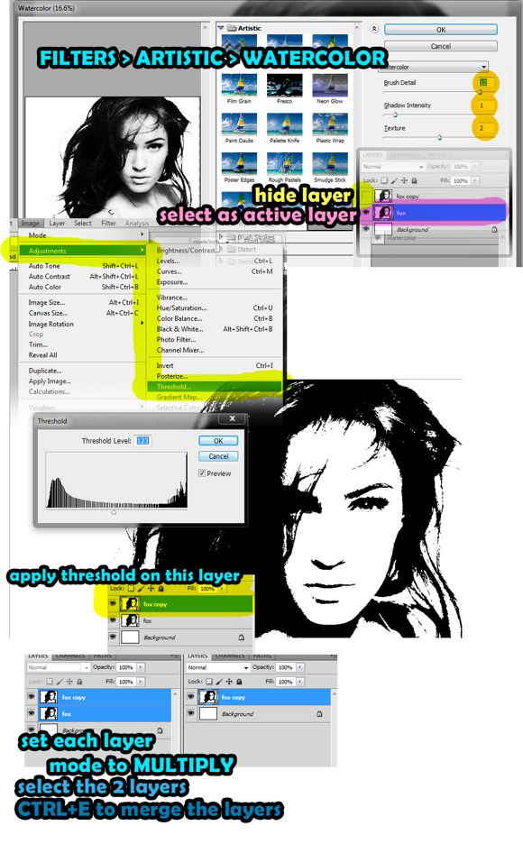
On the layers palette, hide the duplicate first, then select the next layer as active. Go to Filters > Artistic > then selecting Watercolor to apply watercolor effect. Use these settings: brush detail = 12, shadow intensity = 1, texture = 1.
Make the duplicate layer/image available again through unhide button. Select that layer as active. Go to Image > adjustments > and find the THRESHOLD function. After that, change the layer blend mode of EACH layer into multiply. Merge the 2 layers afterwards by pressing CTRL+E.
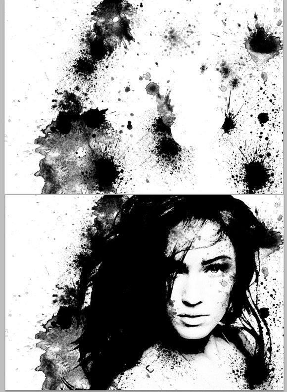
Now we are going to prepare for the watercolor or blood patterns. First search and download free images using these keywords, watercolor, paint, splatters, or splat. Try to find ones like you see on the images below. It is strongly suggested you search for “watercolor splatter Photoshop brushes. Once you have downloaded the necessary files, import these images to the main project document. You may use brushes (*.abr files) or image formats to add the splatters. Brusheezy dot com is one great place to start looking for splatters.
If you are using brushes, use black as color. If you are using images, import first, the DESUATURATE image using SHIFT+CTRL+U. you can use burn tool, or duplicate the image to add intensity to the splatter. After adding the splatters, merge that splatter layer with the face layer.
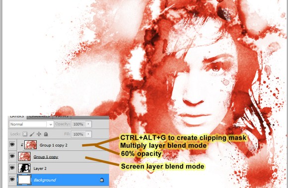
Now download or use a second set of splatters. But if you have not got one yet, you may actually use the same brush or image set. Create a new layer and FILL it with white background, and partially fill the whole canvass with watercolor stains, splatters like you see below on the example. Again this will be quite tricky if you use images instead of brushes. For now let us stick to Photoshop brushes. Assuming you already know how to load custom brushes to be ready for use in Photoshop, paint using the splatter brushes to fill the canvass. Use 60-70 percent opacity(depending on the brush default opacity) and blood RED as the main color.
Some splatter brushes have semi transparent properties which when used, does not apply in full strength even when the brush is set to max. you may have to create duplicates or apply paint twice to add opacity.
Set the layer blend mode to screen. Duplicate that splatter layer, but change the layer blend mode to multiply with 60 to 70 percent opacity. After changer blend modes, press CTRL+ALT+G to clip it to the layer below.
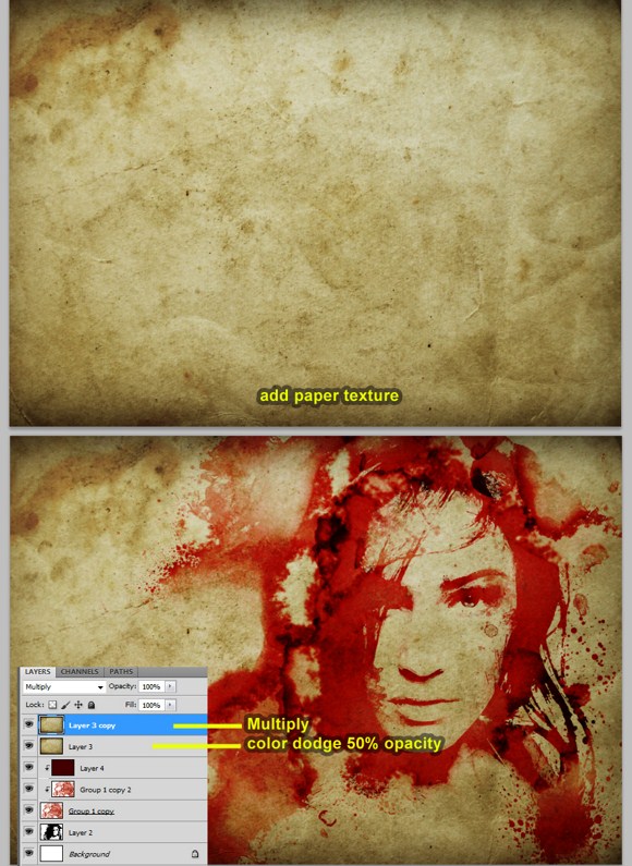
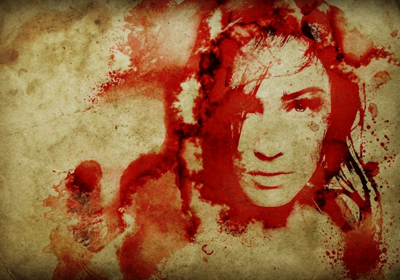
And last steps. Open up your browser, search and download images using tags “paper texture”. Make sure you download those with reasonably large resolutions. Import the paper texture to the project. Duplicate the texture layer. Set the topmost texture layer to multiply layer blend mode with 100 percent opacity. Set the second texture layer to color dodge blend mode with 50 percent opacity or more but not close to 100 percent. And there, you have now a portrait of a person painted on an antique piece of paper and painted in blood.
That is it for this week. Hopefully you learned a lot and had some fun. Please ask questions and share your creations in the comments.
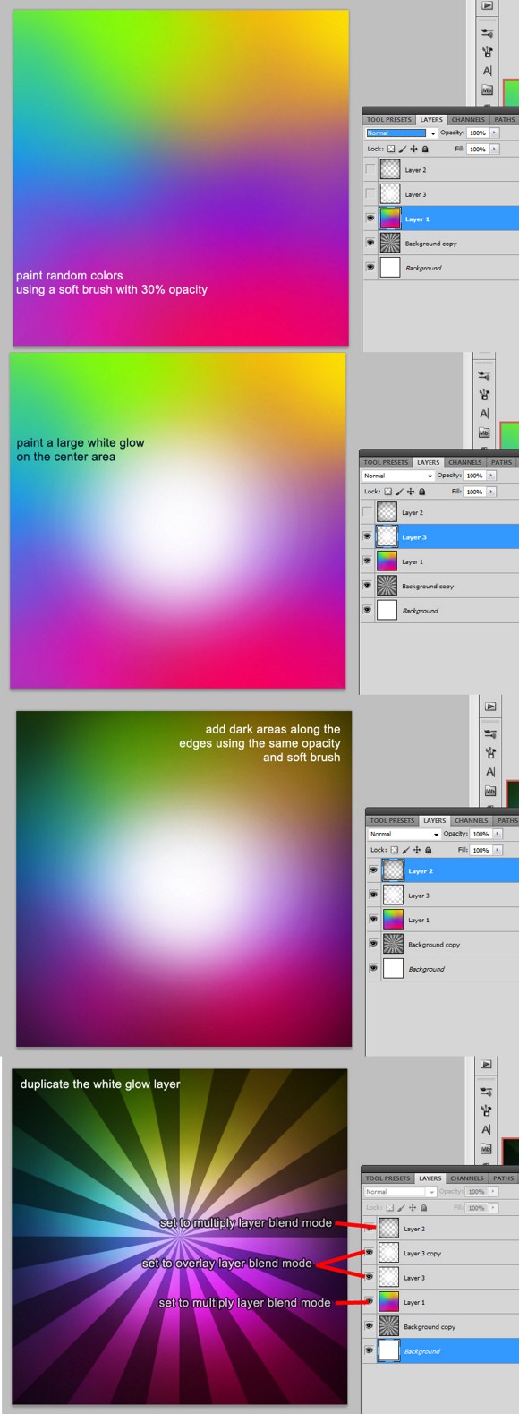
Bursting with Creativity? Check Out this Awesome Sunburst Photoshop Tutorial
This tutorial will show you how to create a very cool sunburst or rising sun effect on Photoshop.
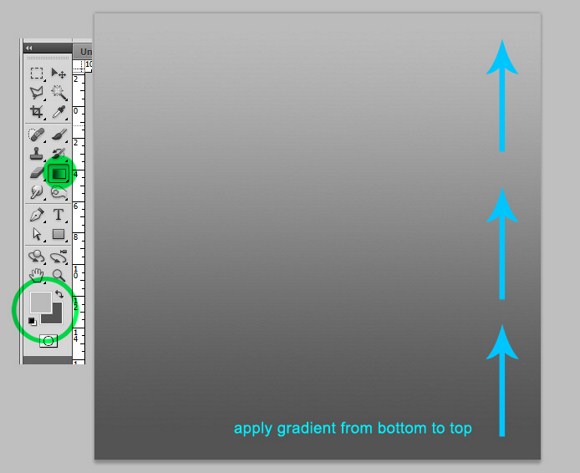
First create a square sized document like 800×800 pixels. This document is for the sunburst image which is also known as the rising sun effect. Select 2 shades of gray for the foreground and background color. You must not choose pure black or pure white.
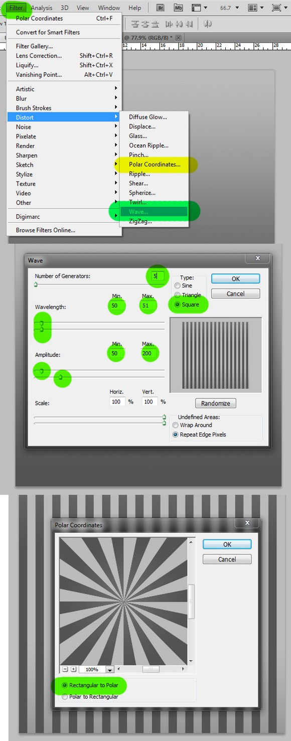
After the gradient part, go to filters > distort > wave. Set the number of generators to 5, change the TYPE to SQUARE, set the WAVELENGTHS max to 51 and min to 50, change the amplitude max to 200 and min to 50.
After creating the stripes pattern, go again to filters > distort > then apply the POLAR COORDINATES and check RECTANGULAR TO POLAR. The result should now create the sunburst effect.
Now we move on to putting some radiant colors on the sunburst. Create a new layer. Select the brush tool (hotkey B) and set its opacity to 30 percent, and a brush size of approximately 300 to 400 pixels. Using random colors, paint all over using the brush settings. It is suggested you paint in the manner used below.
Next, create a new layer again, and paint a large, pure white glow in the middle area. You may adjust the brush size to suit your taste. Now, paint some black areas on the edges using black color.
Duplicate the white glow layer, and use these following layer blend mode settings:
The dark edges layer – set the blend mode to MULTIPLY.
The white glow layer – set it to OVERLAY
White glow duplicate layer – set it to Overlay but with 50 percent opacity
And the colored layer – set to MULTIPLY
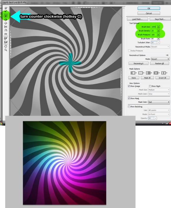
Lastly, select the sunburst layer, then go to Filters > and select LIQUIFY (hotkey SHIFT+CTRL+X). set your brush radius (found on the right side) to about 1000 pixels. Apply pressure on the center, and gradually reduce the size of the brush to achieve much appropriate swirls on the middle. Apply the filter effect.
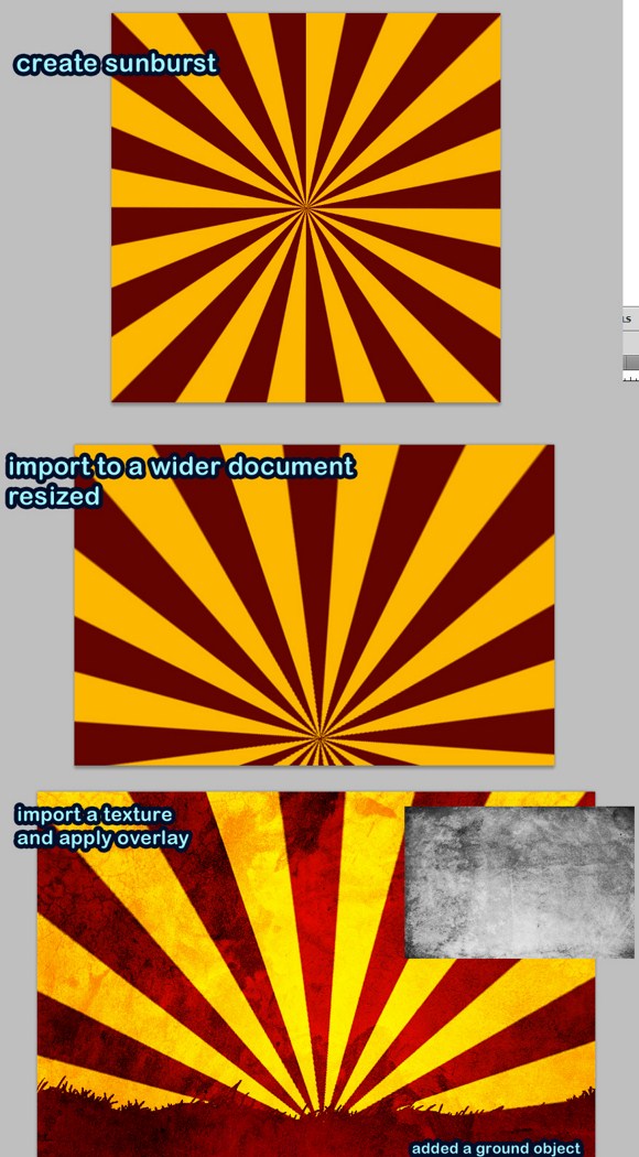
Ok, so basically, that is how you create the sunburst effect with the swirly stuff. But there is another way to create sunburst or rising sun effects with only two colors.
Using the same first steps mentioned above, the gradient + distort wave stuff we did, create a sunburst using and orange/yellow and red pattern. After creating the effect, we import or copy it to a landscape document. Draw a landscape using the default grass brushes.
Then import a paper or grunge texture (the texture layer should be the topmost layer) which you can download from any stock image site. Apply an overlay blend mode to that texture layer and viola we have an awesome landscape with the rising sun effect.
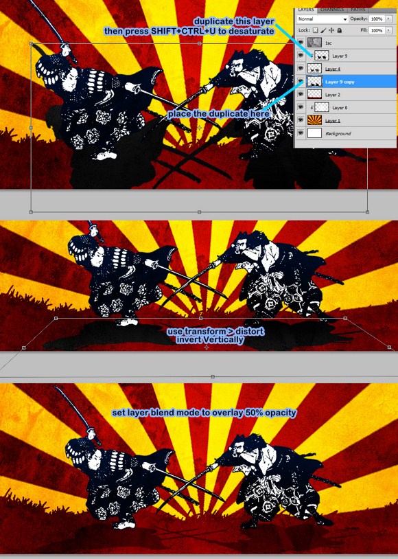
Here’s a bonus. Search the web using these keywords: samurai, geisha, free, and vector. You can also download any VECTOR or SILHOUTTE images to use as subjects in the image. Import it to the document just like the example. Delete the background using the marquee tool. Note: if you can’t find black and white images, you can use Image> adjustments > threshold on your image.
Create a new layer. Press ALT+CTRL+G to clip layer. First paint a dark blue over the clip art. Then paint black later using 30 percent brush opacity on the lower parts. Set the layer to screen.
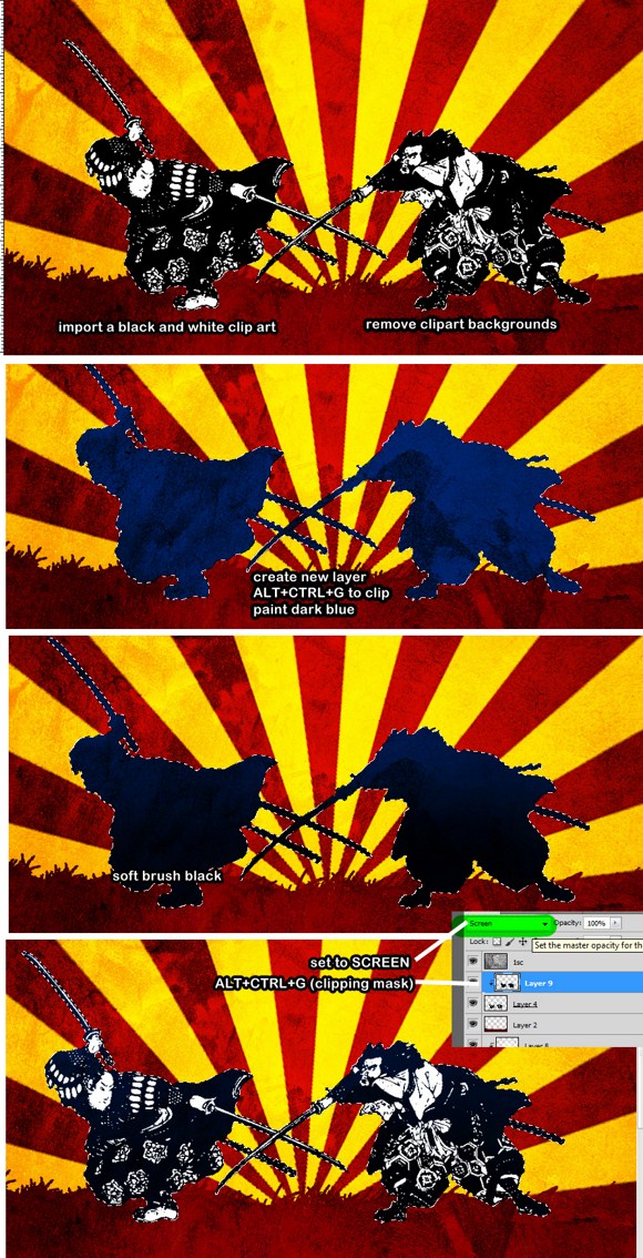
And for the last few steps, duplicate the layer which was clipped earlier (blue and black color), place it below the clipart layer. Transform it, invert it VERTICALLY, then use distort to reshape it into a realistic shadow. Set its layer blend mode to overlay and set the opacity to 50 percent.
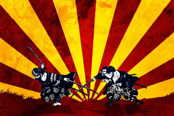
Here is what the finished product should look like:
We hope you enjoyed this tutorial. As always, please feel free to ask questions or share your creations in the comments.
Remember to check back next week for another great tutorial.
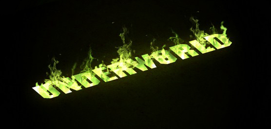
Photoshop the Underworld with this 3D Text Effect
Many of you, including me, have already stumbled upon several Photoshop tutorials like this on other web sites. Unfortunately, I was not able to follow right away because of the confusing instructions and left out parts and details which are very important. So here’s my detailed tutorial of this Photoshop technique.
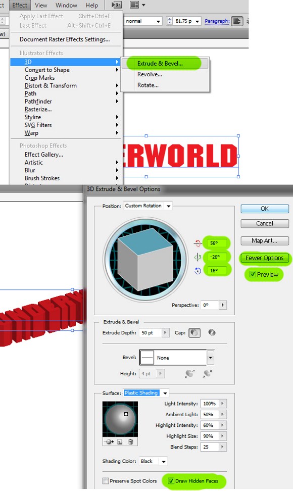
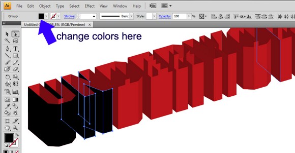
The main feature of this technique is the creating of the 3d effect. We will be using Adobe Illustrator to prepare the 3d text. You also need to use a SQUARE type of font to make things a bit easy. Search and download for fonts like Antrox or Blockbit. You can find these fonts for free at UrbanFonts.com.
On Adobe Illustrator: Create a new document in illustrator (standard RGB) then create text using the square fonts. Go to Effects > Bevel and Extrude. Set these degrees adjustments: 56, -26, and 16. Enable More Option, Preview and most importantly, the Render Hidden Faces.
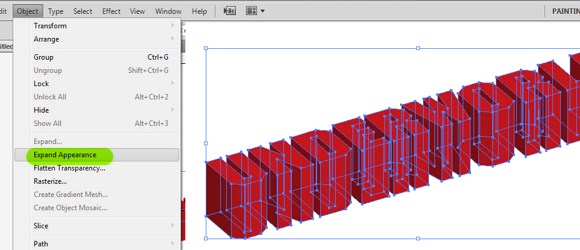
After the 3d text is done, go to Objects > Expand Appearance. Now you will see the separated paths of the 3d text. Now activate the direct selection tool (hotkey A), and click on the text topside faces. Once you have selected the faces, delete them.
Select carefully each visible face facing outwards then change their colors into solid black. Look at the image this is the reason why we need to use square fonts. Text with curved areas are very difficult to select and modify once extruded. To change the colors just find the small box on the top left area of the interface and change the color to solid black. DO NOT CLOSE the Illustrator yet.
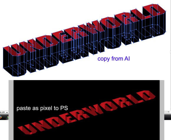
On Photoshop, create a new document (1500×1000 pixels) and fill the background with solid black color. Copy all the paths in Illustrator including the black faces and paste it as PIXELS in Photoshop.
Once copied in Photoshop, REMOVE the black parts using the Magic wand tool. (At this point, you can now close Illustrator.)
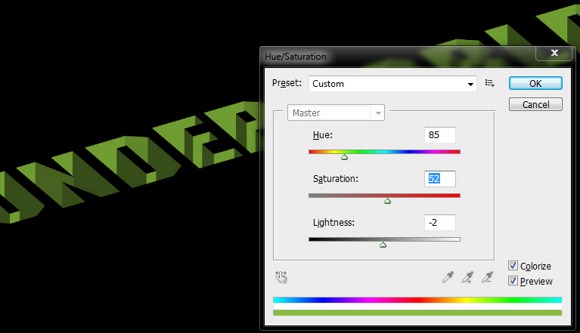
Recolor the 3d text using the Hue/saturation tool (CTRL+U), and adjust the color to make it something in the shade of green. enable the Colorize option.
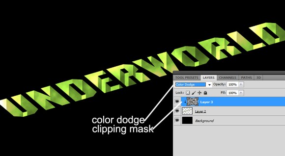
Create a new layer. Go to filters > Render > Clouds (make sure you press D to revert the colors default). On the clouds layer, press ALT+CTRL+G to create clipping mask. Change the layer blend mode to color dodge.
First, create a radial gradient background using a dark shade of green.
Next, duplicate the text layer including the clipped layer, the merge the duplicates. In the layers palette, send the duplicate below the main 3d text. Go to Filters > Blur > then Gaussian Blur. Use about 30-40 pixels.
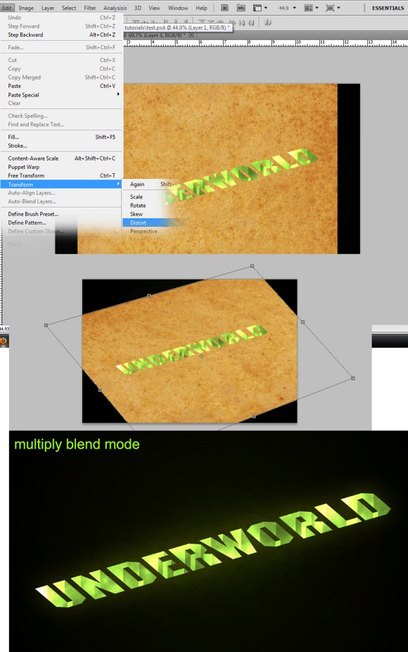
Create a perspective ellipse in color white. Apply again Gaussian blur using 45+ pixels radius. Set the ellipse layer to overlay blend mode. Once done, you may have to resize all the objects smaller to help with our next steps.
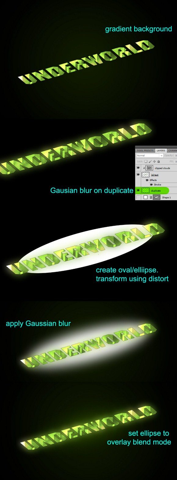
Search and download for a “paper texture” like the image below. Import it then transform it using Distort. Place the layer next to the 3d text and set it to multiply blend mode. (You can add more textures like cracks to make it more awesome.)
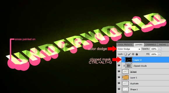
Create a new layer; place it on top of all other layers. Fill with black color and set to Color Dodge mode. On this layer, create clipping mask (CTRL+ALT+G). Grab your brush tool and change your active color to WHITE. Paint on areas where you need to brighten the 3d text. You may have to reduce the brush opacity to 50 percent if necessary.
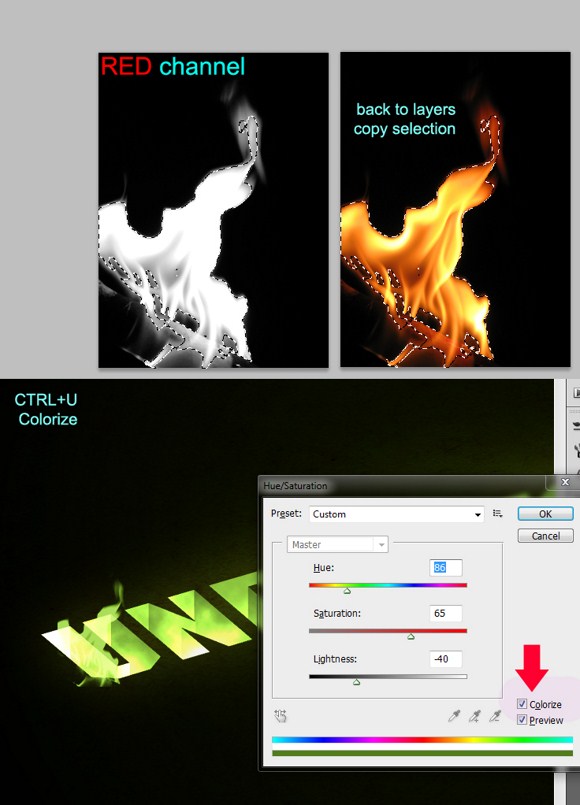
And the last part, the flames. Search stock images of flames on sites like sxc.hu.com. open a flame image in Photoshop, then go to the Channels Palette (next to layers).
Select the Red channel. CTRL+CLICK on that channel. Go back to layers and COPY the selection. Paste it on the main document and change the layer blend mode to Linear Dodge (or screen perhaps).
Press CTRL+U, enable colorize, and adjust the parameter to match with the main color neon green. Repeat the process above and add more flames. You may use smudge to change the shapes of the other flames.
And we are done. Aside from flames, you can also choose to add smoke or lights.
Please feel free to share your creations with us in the comments.