
Just like any other businessman, I too have this strong desire to empower users to sign up for and buy my services any time they want, using any device that can connect to the Internet. However things such as budgeting, potential for revenue, and the type of business you have are the kind of annoying “practical” realities that always come in the way.
Therefore, I started to look at this from the perspective of the developers and see how hard it is for them to make a version of the website suitable for mobile browsers. After all, the amount of money I have to spend getting it done for me would be quite proportional to the amount of challenges a mobile web developer would face trying to give me what I want.
Moreover, once I know the kind of work my web developer would have to do on my project, I can tell whether he’s really quoting a fair price or trying to take me to the cleaners.
Purpose of the Website
Do you want people to just be able to read through your website and contact you, or do you want them to be able to do things such as purchase stuff, sign up for your services, play a game, or something else that requires a higher level of user interaction?
This will also decide whether the developer has to just design a bunch of web pages for optimal viewing on hand-held devices, or whether he has to create some kickass application that people should be able to access and use easily on their tiny screens.
Even if you’re not up for a complete mobile store, I would at least allow my subscribers to receive regular updates for all the current stuff going on with the company – promotions, offers, contests, or anything else that can be valuable for the customers who have agreed to receive such information.
For example, if receiving calls from customers is something you absolutely need for your business, why not give them an easy-to-use website where they can easily locate a clickable number? Imagine having to wade through your mailbox to find a vendor on one hand, and having a simple URL from where all you have to do is click in order to dial! I would choose the latter as a customer any day of the week.
Which Mobile Devices to Support?
Ensuring your website strictly follows the standards that are implemented in the phones with the highest market share should be the first step. Because believe me, as much as you want everyone to be happy, there are nearly 43 million or so smartphone users in the US alone. Here’s a chart from the Neilson company’s presentation earlier this year:
In other words, whether you or not you want to include all the mobile phone users in your plan, you definitely don’t want to leave out the guys who use the iPhone, the Blackberry, or the ones with Microsoft Windows Mobile devices.
Now, making something compatible with more devices means more complexity. Which means more effort for your developer, and most probably, more cost for you.

Mobile Browsers to Support
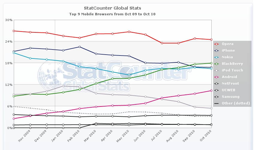
Once you’ve decided which phones you’d like to support, you also have to know that each of these phones is capable of using more than one browsers. Here’s a graph from StatCounter for the market share of mobile browses for the past year:
As you can see, Opera, and the default browsers for iPhone, Nokia, and Blackberry are the top contenders. Android seems to be catching up soon as well. Therefore, your website needs to be able to support all these browsers if you’re going to create a portal that can reach out to most of your customers.
The Existing Website
Does your existing website rely heavily on Flash or is graphic-intensive? If so, that’s going to be another challenge for your web developer. Apple has been quite notorious about their policies with flash, which means that as much as you may hate their guts for this, you can’t really ignore the large market share iPhone has and the fact that you need to create alternate solutions for these users.
Moreover, bandwidth is still a constraint for many mobile users. Therefore, you need to ensure that while you need to preserve the look and feel of your website, you can’t overburden your reader with the cost of displaying all that content. You’ll probably have to work on redesigning your web identity to fit into the world of mobile phones while ensuring that you retain the most essential elements of your brand.
You might want to do this in conjunction with your web developer, because based on their recommendations, you would have to come up with a suitable strategy; you wouldn’t want to create a whole new plan only to later find out that you can’t quite implement it, right? This may even increase the time required for development significantly.
Implementing Marketing Tactics
You may want to consider whether you’d like to implement some marketing tactics such as sending offers to people as texts — if that’s legally allowed in the region you’re targeting and if your subscribers have agreed to receive such updates. For example, SMS marketing is a major thing in India — the whole of Asia and even Europe as a matter of fact — at the moment. If the market you wish to target has scope for this, the right kind of SMS marketing coupled with a mobile website that is ready to accept orders could make a killing for you.
To sum it up, creating a mobile site for your business is definitely a great strategy and something nearly all kinds of modern-day businesses could use. However, it is nearly not the same or easy as having your usual website created. Moreover, it’s not something you have just for the sake of it like so many businesses do with static web pages they do not change for decades. If you want to corner this booming market of smartphones, you need to do a lot more than just create a web design concept or hire a good developer. It’s a akin to creating a new division in a real-world business, and you need to be just as careful and diligent with it.
How important do you think it is to have a mobile version of your site? We would love to hear your feedback in the comments.