Responsive Web Design
What is responsive web design?
If you are web designer or developer, you are well aware of the challenges of the modern design – not only you need to meet your client’s needs and expectations, but you need to make sure that your designs are compatible with most of the popular screen resolutions and devices. Your work should look good on computers and laptops with different screen resolutions, and you should make sure that is perfectly suitable for mobile devices as well. So far, most of the designers have responded to the increasing popularity of mobile and tablet surfing by creating a separate version of their website’s design – one, which people could access and navigate on the go, from any mobile or smartphone, without having to scroll left or right indefinitely. However, with the number of new web-enabled devices launched every year, keeping up with all of their settings and characteristics is a task, which is next to impossible, and this is what brought up the concept of the responsive web design. The responsive, flexible, or adaptive design is the idea, which makes your new beautifully crafted design viewable on any device, regardless of its screen orientation or resolution. Adopting this concept could also increase your productivity as it allows you to achieve the same results with fewer efforts – instead of creating a different design for each group of users or device, all you have to do is make your only design adapt to the users’ settings.
This idea is not exclusive to the Web alone and car designers and architects are working hard on adopting it as well – in the very near future, you luxury sedan might be able to change its form and shape as soon as you enter an urban area and turn into a small city car with the push of a button. In similar fashion, buildings might become more flexible and change their dimensions or characteristics, according to the number of people or shift in the outside conditions.
How is responsive web design achieved?
In order to achieve responsiveness, you need to use flexible elements in your designs, and this does not pertain to flexible grid foundation only, but to flexible images as well. Additionally, using media queries is an essential part of the process since they are the element that allows your designs to evaluate the device’s screen resolution, orientation, color, and the browser’s window size as well, and then load the corresponding stylesheet.
Flexible grid – using flexible grids is nothing new and there are many predefined flexible grid systems, which you can easily incorporate in your responsive web design. Of course, you can build your own custom solution, where all you have to do is forget about the pixels, use percentages instead, and keep a close eye on the size, spaces, and alignments. The desired result is a grid, which adapts to changes such as screen resolution, browser window size, or font, all while retaining its original proportions.
Flexible images – while flexible grids are something that many designers are well familiar with and might have been using for years, flexible images are just a tad more challenging. Having your images to scale down or crop can be achieved in a few simple ways, each one of them with its advantages and disadvantages. The first one is changing the images height and width attributes, using HTML tags, although this is something that most developers have been taught to avoid – after all, scaling down a very large image could make the website unresponsive. However, on less image-rich designs, this is still a viable option. Alternatively, you can use the overflow CSS property to crop the image or have a few different size versions of the same image and dynamically load the one, which corresponds best to the user’s settings.
Media queries and responsive web design – some designers and developers consider the media queries the most essential part of a responsive design, but the truth is that unless they are coupled with flexible foundations or images, they are not much of a use. While CSS 2.1 brought up the media types, which were somewhat flexible, the main advantage of the media queries over the media types is their ability to inspect the characteristics of the used device. This, in turn, allows us to build stylesheets for desktop computers, notebooks, iPhones, Android phones, and every other web enabled device. Some of the new features of the media queries such as orientation, min-width, and min-width ads to the flexibility of the media queries and helps web designers and developers keep up with the variety of the used devices.
Many of the components, which responsive web design incorporates are nothing new or revolutionary, and you might have been using some of them for a long time and currently experimenting with the rest; some are actually nothing more than common sense or good practice, but adopting the concept will definitely help you build more universal designs and win more customers. Keep in mind that using flexible grids, images, and media queries is not a bulletproof approach – even though most versions of the popular Internet browsers support media queries, some older ones that are still used by millions of Internet surfers do not.
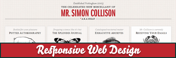
Examples of Responsive Web Design
There are great many publications, articles, and tutorials, both online and offline, which take a closer look at responsive web design, and which are accompanied by many code snippets that can get you started. In addition, we have put together a small list of some of the most impressive responsive web designs:
1.

2.

3.

4.

5.

6.

7.

8.

9.

Each one of the above-listed web sites uses adaptive web design, which looks just as beautiful on desktop computers and laptops as they do on Smartphones and tablets. They could serve as an inspiration to all of us and hopefully, steer us in the right direction; there is little doubt that keeping up with the technological developments has become quite demanding, but building flexible and responsive web designs is not only challenging, but quite rewarding as well.